Ask a 60s futurist what they’d imagined the 21st century would be like and I think you’d find they weren’t far off the truth. From molar mics that transmit sound directly into your head to in-depth studies of Mars, the world of Arthur C. Clarke and Isaac Asimov seem more reality than fiction. However, while some dream of androids and electric sheep it seems the digital community has started turning back to their analogue roots. From the hipster tropes of record players and film cameras to grand architectural designs incorporating texture, the pendulum has reached its apex and is beginning its slow swing back to feeling, sensation and tactile design.
Vinyl Revival
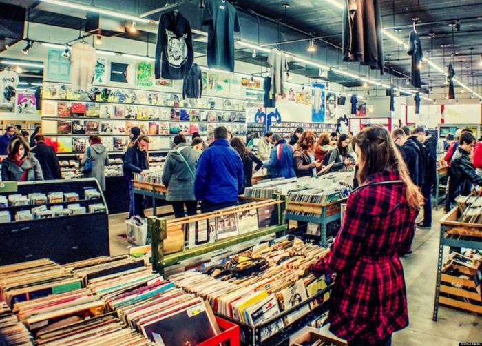
A brief glimpse down a town’s high street shows the seeds of this movement. Tucked away in a corner is a dusty record shop that ten years’ ago stood empty but is now packed with people flipping through second-hand and new records alike. This phenomenon, known as the ‘vinyl revival’, has taken hold across the world with global trade increasing from $55 million in 2007 to $416 million in 2015. In the UK alone, sales reached a 25-year high in 2016 and look set to continue to rise. This may seem odd considering the capabilities and convenience of music streaming programs like Spotify and Google Music but it seems there is space for both the clarity of a FLAC file and the crackle of a vinyl.
Film Fans
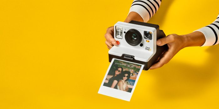
A similar trend can be seen in the rise of film cameras. From SLRs to instant cameras there has been a boom in the production of not just film but new camera models too. In a report by The Guardian, the first new single reflex film camera to be designed since the 1990s has been released. Named the Reflex, this camera rose off the back of Kodak’s fall from grace. After selling nearly a billion rolls of film in 2003 there was a sudden collapse that saw the film giant fall into bankruptcy protection in 2012. However, much like vinyl, the mid-20-teens saw a huge revival of the film market as people wanted to bring the ‘gram’ to life.
Nothing New Here
The reason behind this need for the physical has been the subject of much study. Studies in the 1950s discovered that infant monkeys chose artificial surrogates covered in cloth over those with milk, while the University of Miami’s School of Medicine found that premature babies make faster recoveries if they have regular physical contact as opposed to being left in incubators. Other studies have reached similar conclusions with experiments showing people who hold warm objects are more inclined to be friendlier to their peers. This desire for sensory experience is inbuilt and has been exacerbated by more and more of our daily lives migrating to the other side of a screen.
Touchblindess
‘Touchblindess’ is the result of this shift to the digital sphere with fewer hands using physical notebooks, pens, maps, calendars and other everyday objects. The Finnish neurophysiologist, Matti Bergström, laments this fact in a lecture stating:
“The density of nerve endings in our fingertips is enormous. Their discrimination is almost as good as that of our eyes. If we don’t use our fingers during childhood or youth, we become ‘fingerblind’.”
This lack of feeling can have real-world effects. From changing perceptions of dating (in person vs. dating apps) to making transactions, there is a difference in understanding the reality of something in the hands versus on a screen. Take a transaction for example. Imagine you had to spend £200. Handing over physical notes feels a lot more real and costly than using your banking app to send a digital payment.
This disconnect is central to the current trends in design with everyone from architects to designers moving towards a tactile experience. They may not be obvious at first but these subtle flourishes speak to a deep urge to feel and sense again.
Design Playing Catch Up
Apps and websites have begun to feel the effects of this trend and started developing in a more human way. From the mid-2000s flat design has been the staple of web design. A quick look at your smartphone will show prime examples of this. Skype’s pared-back design, a light blue background with an ‘S’ created in the negative space of a white circle is the epitome of flat design. Apple has also maximised on this trend with the clean lines and use of space reminiscent of a space-age future. There is no gritty humanity, no cracks with roots and shoots poking through, no evidence of texture.
When Flat isn’t Flat
This is where ‘semi-flat’ or ‘flat 2.0’ design steps in. It combines the best parts of flat design, clean lines and professionalism, but adds emotion. ‘Flat 2.0’ is also described as the marriage of minimalism and skeuomorphism and it accomplishes this in several ways drawing on retro techniques, usability, mixed media or by challenging the very taboos of flat design itself.
Highlights, gradients, shadows, multiple typefaces and variable colour palettes are all broken in this new trend adding much-needed texture to the digital experience. Instagram’s logo is a great example of this as is Spotify’s playlist styling. Both apps use gradients and colour palettes in a playful manner to create a flow hierarchy.
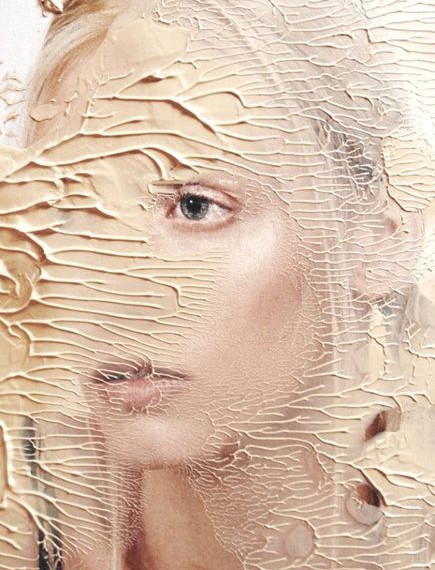
Another way this new trend takes form is by introducing various forms of decay. Glitches, tears, burns, sepia and colour bleeding bring texture to a pristine glass screen and create a striking image that draws not just the eye but also touch.
Throwbacks are popping up more and more and are a great way to add some artistic flair to the purity of flat design with illustrations, photos, and mixed media bringing the real and the digital together with a bang.
Using shadows is one of the most common ways to challenge the norm. Long shadows add an extra dimension to the image and bring a sense of depth and reality to designs.
All of these techniques are often used in conjunction with skeuomorphism and minimalism to create the best of both worlds. While we may be looking back to analogue lives it doesn’t mean our digital lives are left behind. Instead, designers much like the everyman, combine elements of both to create a uniquely 21st-century experience. Instagram alongside Polaroids, Spotify alongside record players and cash alongside contactless cards.
Tactile Design
While Flat 2.0 is leading the charge there are other movements not far behind. Tactile design has become a hugely popular movement. From detailed photography to borderless design, responsive logos and micro-interactions there are a plethora of ways designers have tried to bring the real to digital.
Photos and a lack of borders are an easy way of emulating this technique. With no hard borders sites and apps become an extension of the world around them while photos introduce texture and real life images to dominate the digital sphere.
![]()
Responsive logos and micro-interactions are more subtle ways of achieving a tactile response. Responsive logos change with the devices, for example, Google may be spelt in full on a PC but will appear as a colourful ‘G’ on smaller devices. This change in scale seems to shift with the device creating a sense that the logo is responding to the world around. This brings the very brand to life.
Micro-interactions, by comparison, are far less cerebral and speaks directly to the kid in all of us. For example, when you take a photo on your smartphone and the screen snaps shut like a real camera lens. This micro interaction is purely for the user. The phone has already captured the image.
Retro Lives On
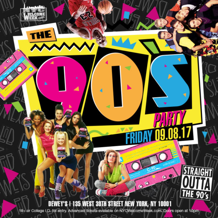
This last trend is hard to place. Whether it’s because Gen X and Millennials have become major consumers or the aesthetics of the 80s and 90s are just in vogue, retro has become cool again. While some may argue that vintage is timeless there is certainly a niche market for shoulder pads and awful 90’s party posters. Neon, geometric prints, patterns and other retro revival techniques bring about nostalgia and texture in equal measure and create an anchor point of reality in the digital sphere. As design moves closer to feeling we may seem other retro trends revived, often with a modern twist.
Taking Cues from Architecture
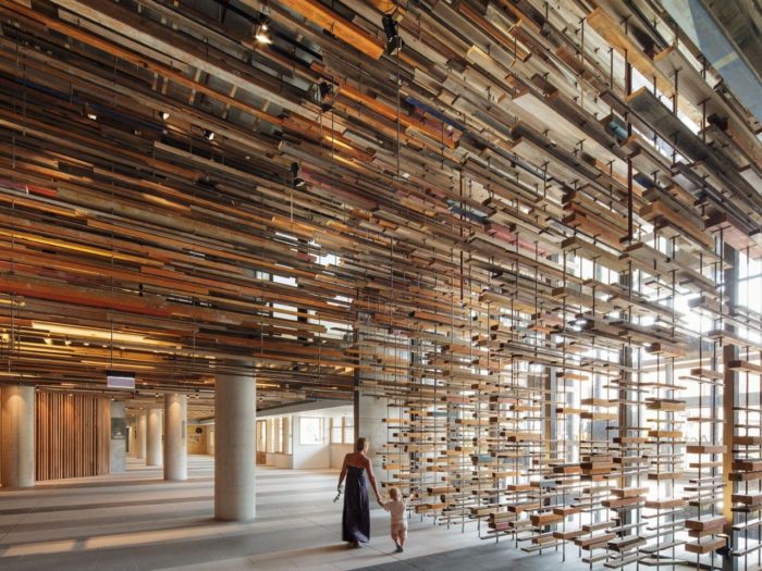
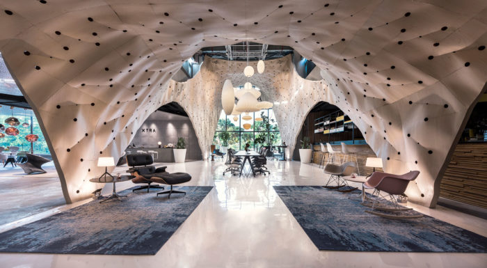
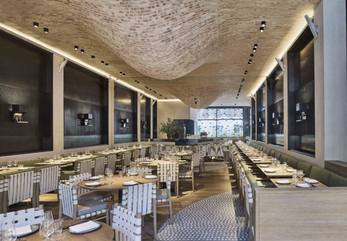
Architecture has been an augury for design for centuries. Rococo, gothic, modernist, Bauhaus, all these and more influenced art movements across the globe and tactile structures are no different. A focus on organic material and shapes has taken hold of architecture with the likes of the timber lobby at Hotel Hotel in Canberra winning the World Interior of the Year award. Other winners and finalists employing textured surfaces and organic shapes include the Produce Workshop at Fabric Wood in Singapore and the Fucina Restaurant in London. This alongside design shows a yearning to reconnect with the natural world and blend the real and digital into a homogenised vision.
All of these styles, trends and flourishes speak volumes about how people experience the world. Designers and brands would do well to heed the change in the wind and set a course for a future of tactile, multi-sensory UX. A far cry from calling for the return of the Luddites, the future of design is an exciting space for the marriage of the digital and the real into something far more exciting than the dreams of androids.