Is a landing page that important for your PPC campaign?
Many people undervalue their PPC landing page, which is in fact an area where a lot of people lose out on improved ROI.
Your landing page is crucial as it’s the first page the customer lands on when they click through from your ad. There are a few key factors to consider when deciding which landing page to use and in some cases, you may even need to create a new landing page specifically for your PPC ad.
- Page design – does your page look inviting and fresh?
- User experience – is it easy to navigate and easy to use?
- Content relevancy – are you landing potential customers on a page which is relevant to what you’re advertising and is it adding value
- Clear call to actions – is it clear for customers to see how to call, make a purchase etc?
Not only is the landing page crucial for the user interaction and conversions but it is also a ranking factor as this largely affects your quality score. This determines the position your ad appears (average position) in the search results, how much you pay for your CPC (cost per click) and how often your ad is shown.
Other aspects which are considered for your quality score are your landing page copy as mentioned, your ad-copy and URL.
What does a bad landing page look like?
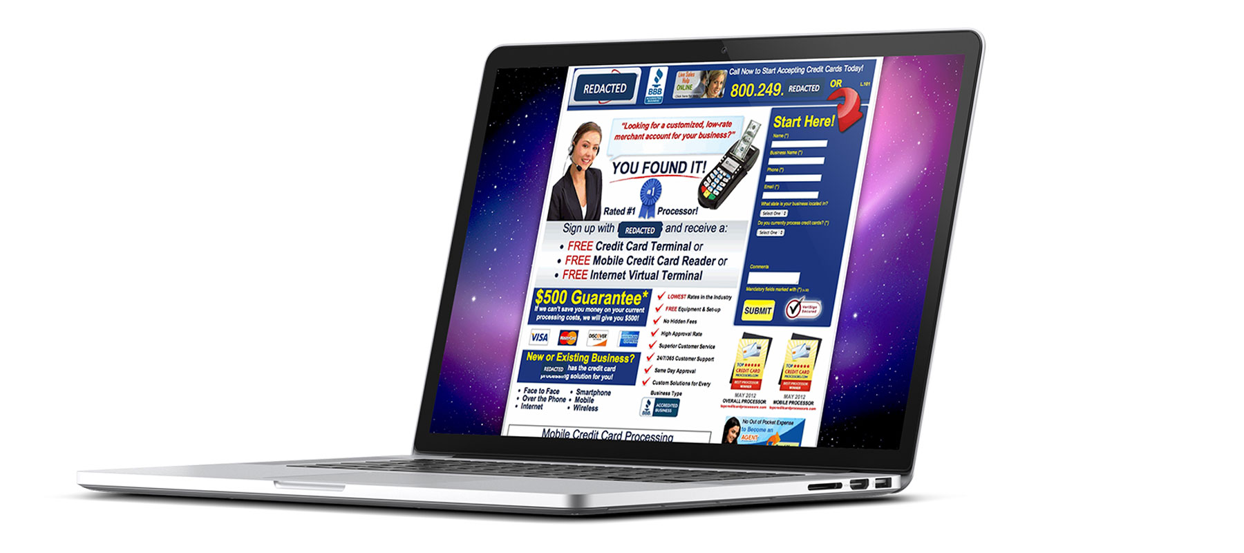
The below website has the issue of putting too many offers and deals on one page which looks cluttered and unclear. Its landing pages include an array of discounts for unrelated products, which could easily overpower a potential customer.
What does a good landing page look like?
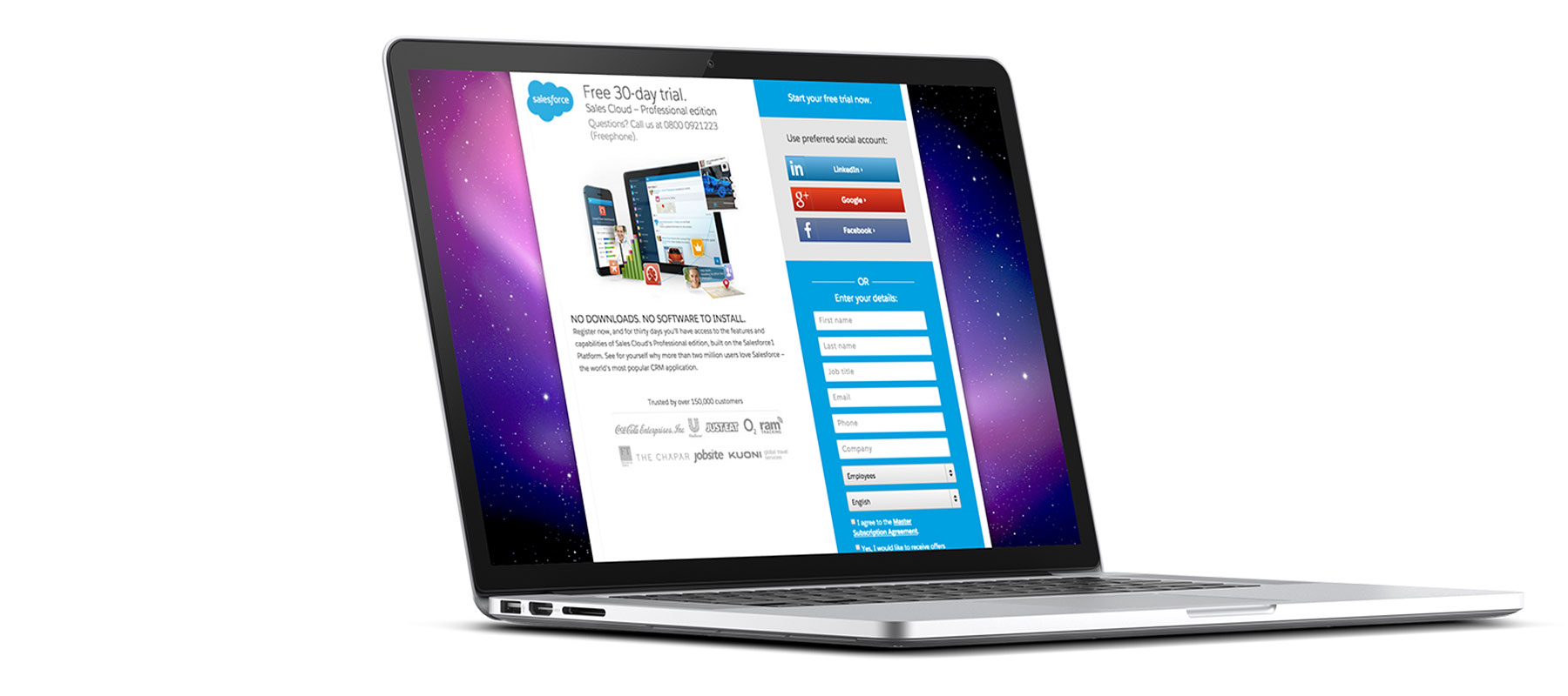
The below landing page has come from an advert offering customer floral arrangements from $75. This landing page is clear, relevant, and a call to action which is easy for the customer to navigate. All the details are laid out just above the fold. All the text describes the benefits of the service and what customers will receive if they subscribe.
So how do you create a quality PPC landing page?
Fifteen have lots of experience in delivering clients PPC campaigns meaning we have managed to squeeze in a lot of landing page testing. Our top tips are below:
Relevancy – ensure that your message in your ad copy is displayed within your landing page. For example, if your advert is advertising laptops, don’t send them to a landing page of desktops.
Highlight the benefits of using your company – make sure you’re giving people insight into your business and the benefits of your product or service.
Call to actions – ensure you have clear call to actions on your page such as ‘enquire today’, ‘book today’ or ‘buy now’ so the customer knows how to gain more information or order your product.
User-friendly – make sure your user journey is easy to navigate through. If people find your website hard to navigate or cannot find what they are looking for they will simply leave the site and go to a competitor.
Simple – is your buying process as simple as possible? The more steps they have to go through to make their final action, the more likely you are to lose them along the journey. This is similar with the payment journey, if they have to answer too many questions, you’re likely to lose them before they’ve made their purchase.
Website design – What does your website look like? Does it look professional or does it look like a spam site? The appearance of your website is important as you want the customer to trust you and the only thing they can judge is your site.
Once you start to adopt a few of the above techniques, you’ll start seeing some great improvements on your PPC campaigns (and it will also benefit your SEO).


