Icons are a very powerful tool within web design. When used properly, they can grab your users attention and help them navigate content quickly and efficiently.
When a user lands on your website we want them to learn that they have come to the right place. If faced with paragraph after paragraph of text, the chances of them sitting down to read every detail can be slim.
Instead, we look for ways to break up the content, increase legibility and capture the attention of the user. This is where icons come in to play.
Humans are visual creatures. According to the marketing industry influencer, Krista Neher, the brain can process images 60,000 times faster than it does text. Splitting up your content into manageable chunks helps fuel your users’ attention span. In addition, icons can help your users to navigate to relevant pieces of content before reading.
To successfully use icons within web design, we need to make sure they are easy to understand. Your icons should utilise commonly recognised symbols to help the user instantly know what the icon is representing.
Along with adding interest and aiding navigation, icons can also add personality to your website design. They definitely shouldn’t be an afterthought but an extension of your brand. Icons work hand in hand with your visual style to add finesse and flair.
The options are broad but we’ve explored a few icon styles that are big in 2020.
Simple Line Icons
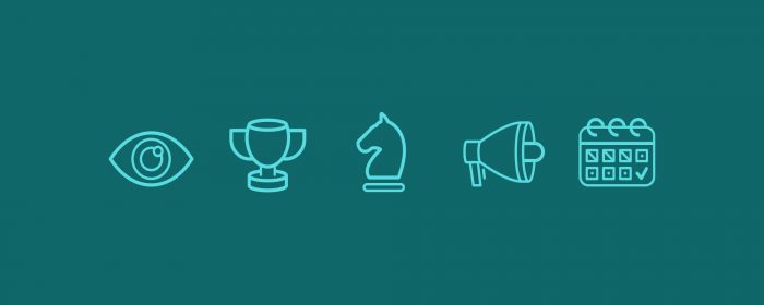
Simplicity is something that is never going to cause a negative effect on icons. We are currently seeing a lot of big companies simplifying their brands and visual elements. We are stripping it back to clean and minimalistic, allowing the icon to be identifiable.
Colour block icons
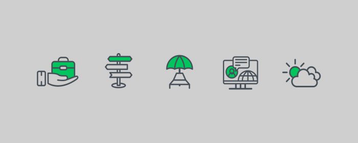
Taking the basics of the simple line icon, website designs are also adding personality to their icons through the addition of colour. This can help to tie in a visual element and colour from the brand’s visual style to create a cohesive look and feel. Whether it’s the addition of a shape or colouring in an element of the icon.
Doodled icons

If suited to your brand’s visual style, hand-drawn icons can add a nice touch to your website design. As if doodled in pen they instantly bring a friendly and approach feeling. The simple design aids the user experience of your website.
Bicolour Icons
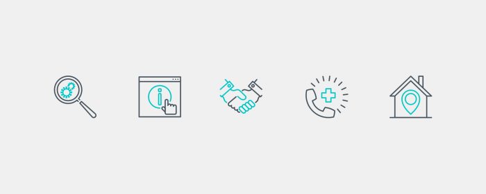
Another adaptation of the simple line icon is the bicolour icon. These two-toned icons have a secondary colour that picks out an element within the icon. These are useful for adding a highlight to the most important part of the icon allowing a little more detail to be included in the icon without losing its impact.
Flat Vector Icons
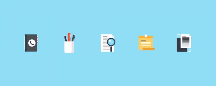
On the more intricate side of things, flat vector icons are still very popular. Retaining their simplicity through the 2D design, these life-like icons bring character and colour.
To round it up, icons should always be designed to enhance the user experience. When designing your icon suite is it good to remember to keep it simple so they can be used at any scale. You will often find them used at all sizes throughout your website design so it’s good to ensure the design is adaptable. An overcomplicated icon can begin to clutter and confuse your website, hurting the overall design.
If icons are catching your attention and you’d like to explore the impact they could create on your website, get in touch today.
