The Solution
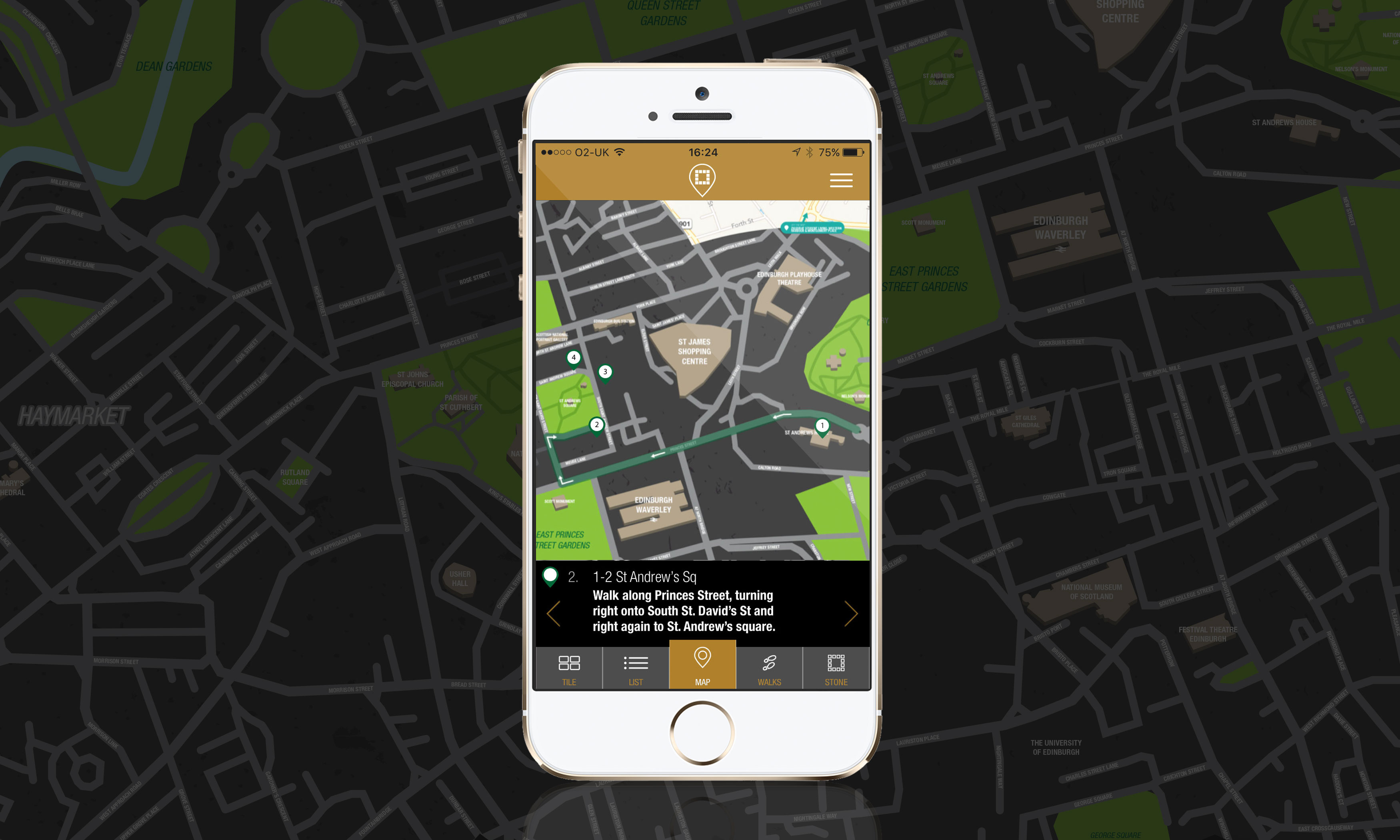
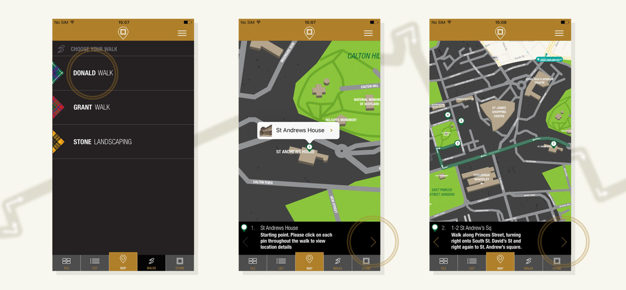
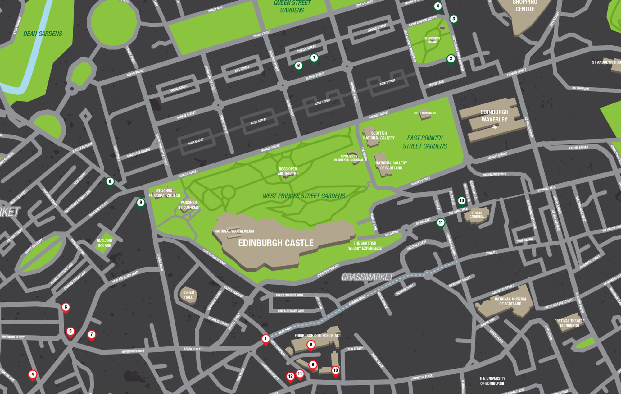
We began work on the custom map from the get go. Once integrated into the app, our custom map graphic overlays an existing Apple map. This allows for precise GPS tracking, while still maintaining a brand style. It also allowed for us to create ‘step by step’ arrow trackers. These are used throughout 2 walks that appear within the app, named after architects who contributed to projects within Edinburgh. There is also a 3rd walk, which samples some of the Stone Landscaping across Edinburgh, but allows the user to map their own journey.
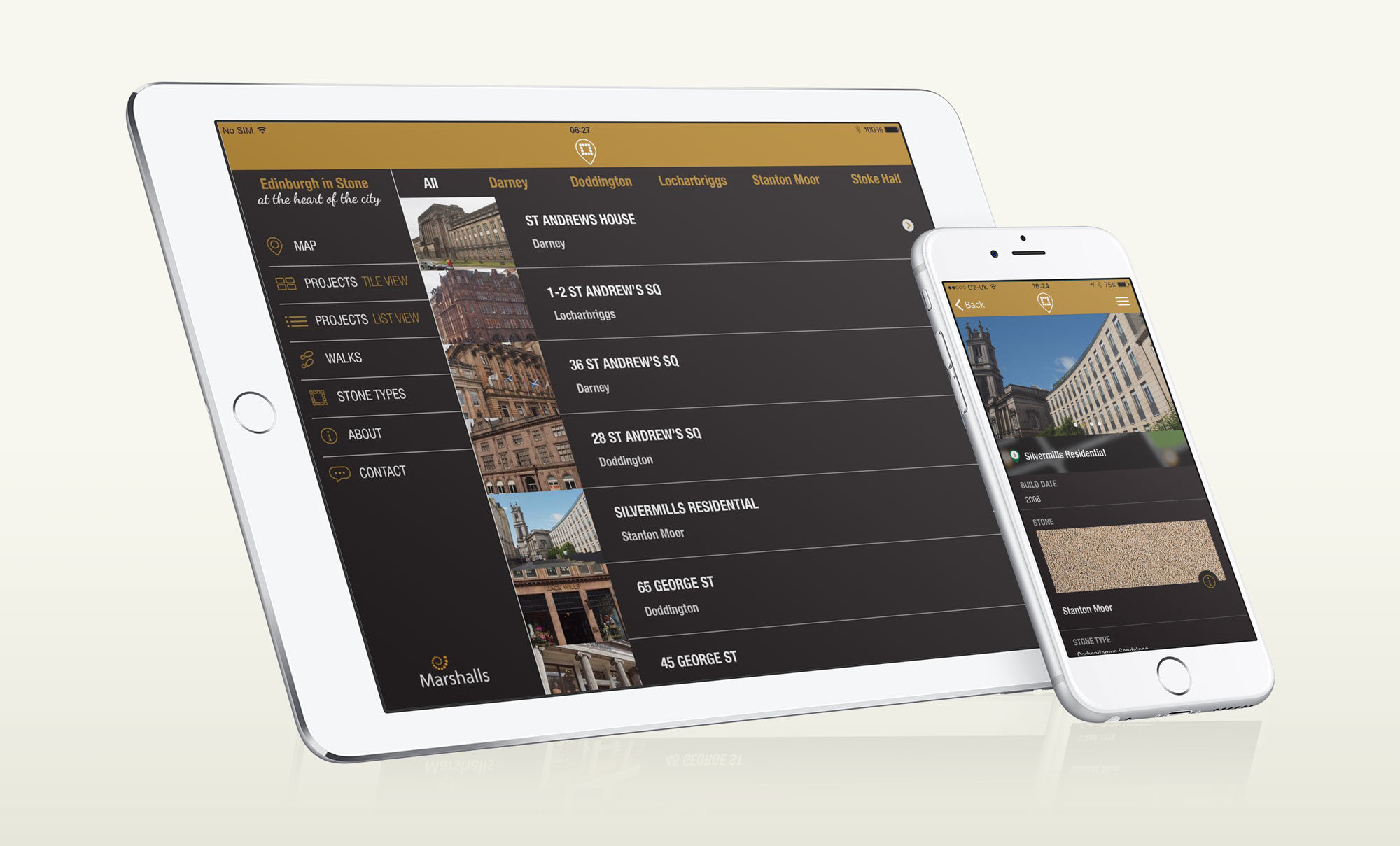
We endeavoured to make this app as user friendly as possible, keeping menus simple to use and the walks easy to navigate through. We kept a simple colour palette, using greys and blacks, plus Marshalls Stancliffe Stones’ signature gold colour to highlight key calls to action.
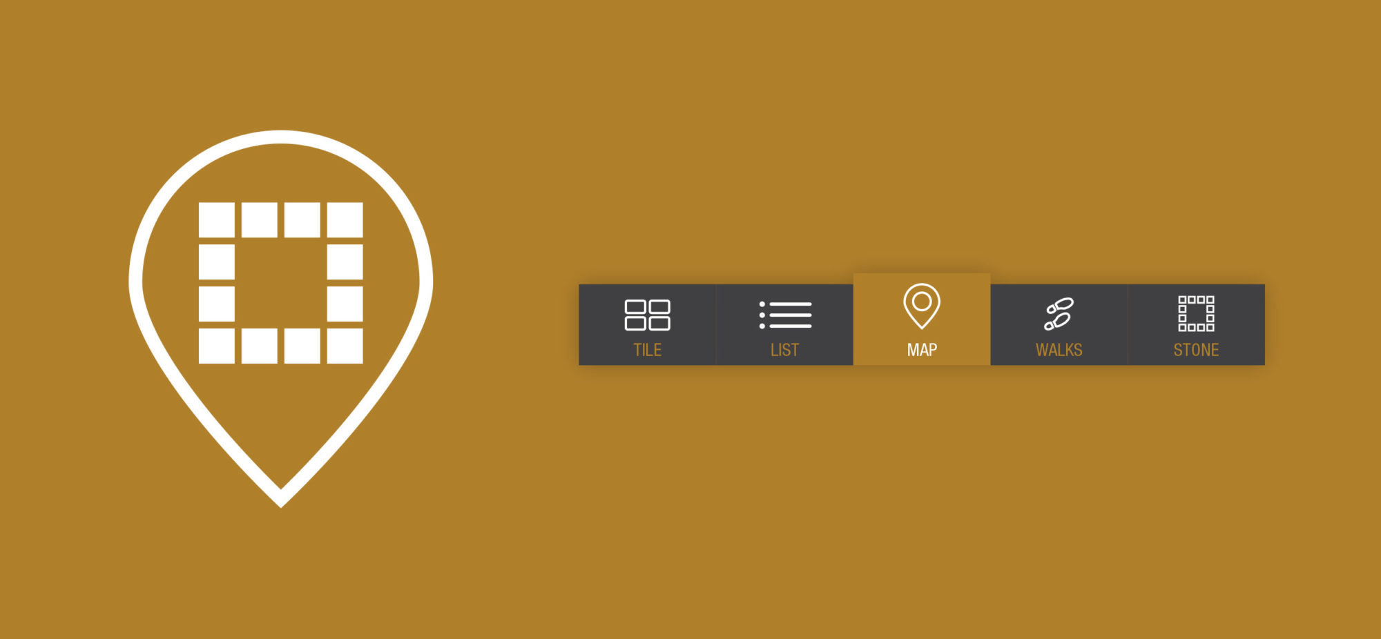
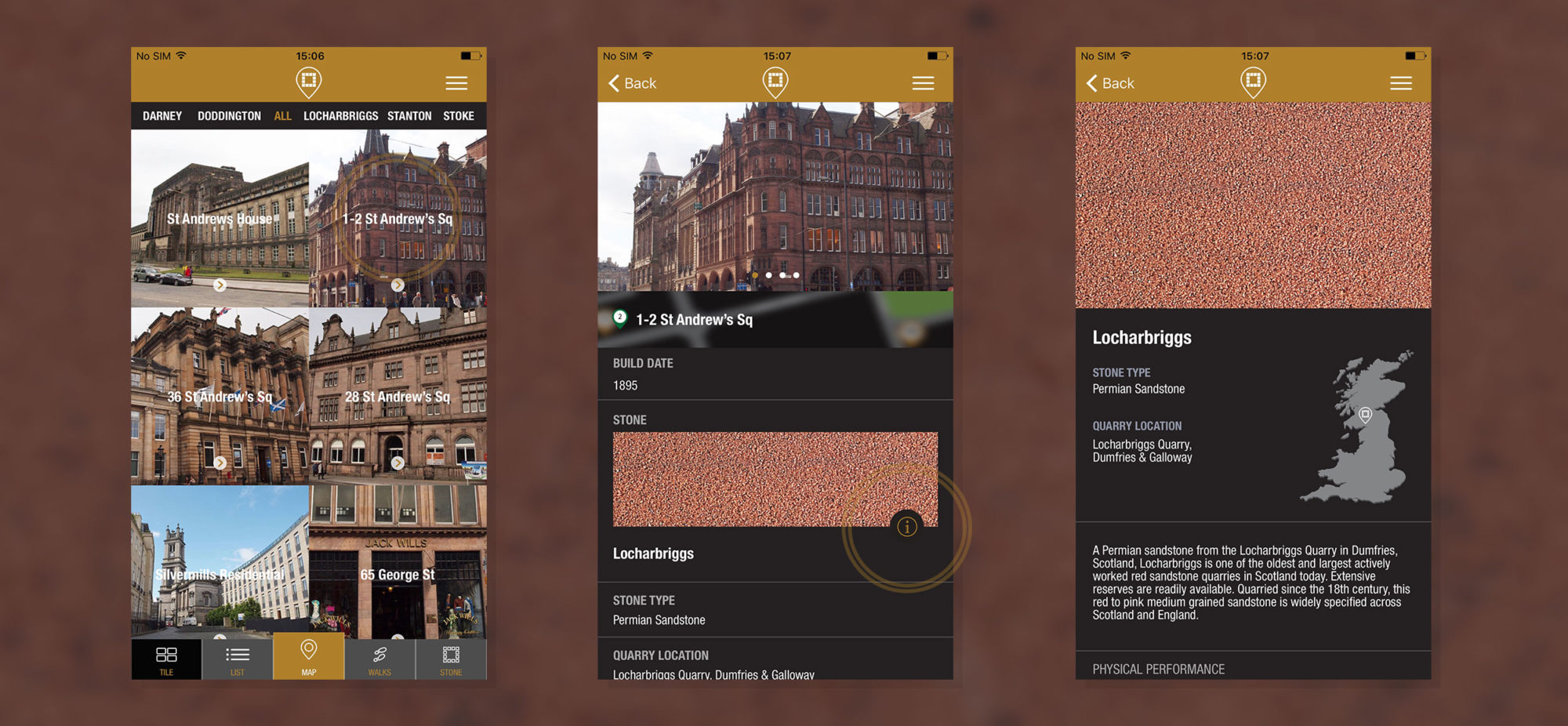
The menu system of the app used iconography to allow the user to navigate through the app without the need to always read text on a small screen. Using simple and recognisable icon styles we had 2 menus that incorporated these. First was a drop down from the main header with options to visit everywhere within the app. We also created a footer bar that made the jumps from locations to walks and the map as easy as possible.
It was important for the app to be an accessible portal to all who wanted to use it. Whether a user wanted to participate in the walks across Edinburgh, whether they were in their office in London, or even at home in Cardiff, the app still acts as a working portfolio for Marshalls Stancliffe Stones.
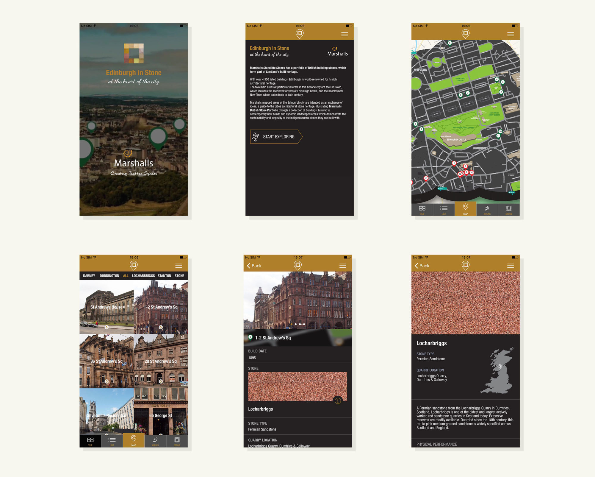
The location pages are shown in either a tile or list view. Tapping through will allow the user to swipe through several stunning photographs of each location. Some location pages also have accompanying video content. The user can also check out more information about this location, as well as the type of stone used at this location.
The stone types also have their own information pages, allowing the user to find out more about the quarry location, specification and go through to ordering stone samples through the app.

