Branding & Logo Design
Fifteen Design were keen to work with Hornigold Haulage on giving their company image a complete overhaul.
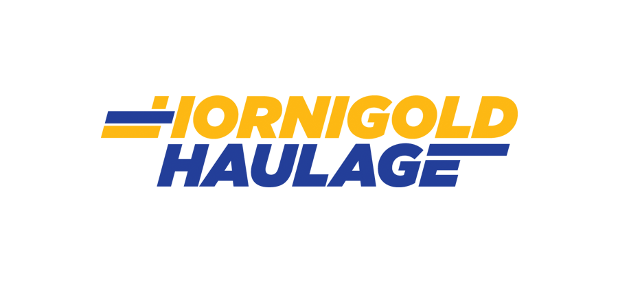
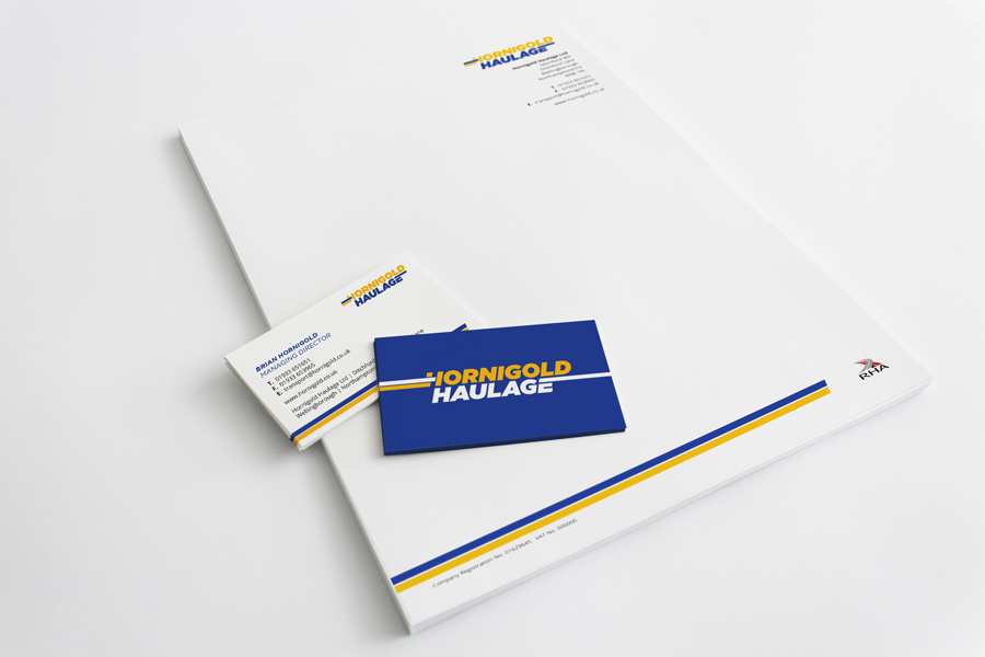
Hornigold Haulage approached Fifteen Design to rebrand the haulage company and create a strong brand that would represent the company on all platforms, from the stationery to their vehicle livery. Our creative team came up with many ideas that visually represents the haulage company. With the final logo being decided upon by it’s powerful visual and hints at speed and movement.
With all branding projects we worked on creating detailed brand guidelines for Hornigold Haulage which describes the do’s and don’ts of the brand and more importantly the creative feature of this logo which sees the sides of the brand adapt to it’s surroundings by extending to the edges.
We look forward to applying this brand to a new website for Hornigold Haulage in the near future.


