New website design and brand for One Connectivity
We’re proud to announce our latest brand and website design launched for One Connectivity. We worked with One Connectivity over the past few months to create an eye catching brand and accompanying website for their newly launched business
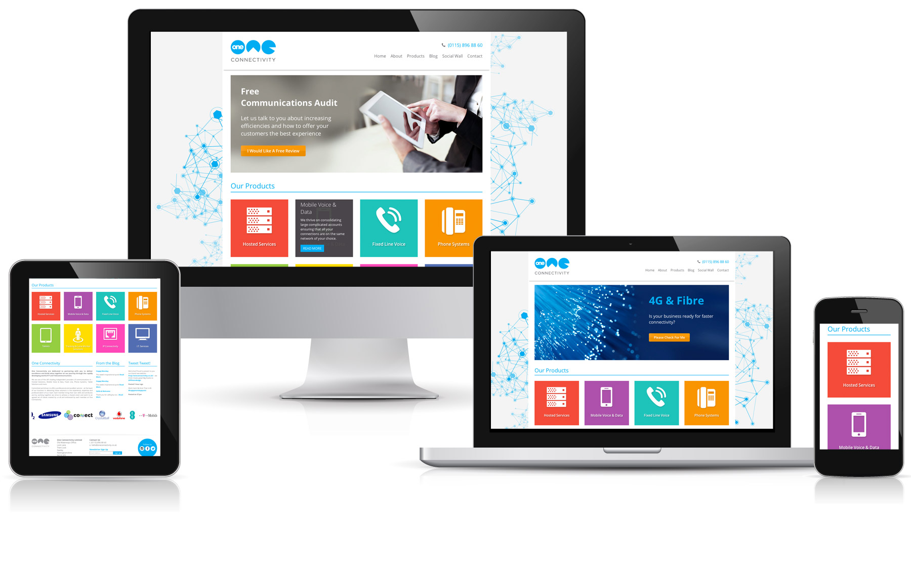
Starting from the ground up, One Connectivity approached Fifteen Design to design a new brand for their company. Working with such a forward thinking company was exciting and we swiftly created several brand ideas based around their technology rounded business. The idea of a circle representing ‘one’ was the starting block for what would eventually become the One Connectivity brand. We used the circle in various ‘loaded’ forms to create the icon. From then we helped devise a colour scheme for One Connectivity and their product range. The products were imporant to identity for the website design so we created an icon set for One Connectivity, once these were created each was assigned a colour from our scheme and would be utilised in the website design.
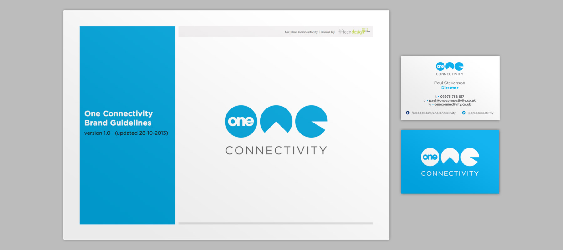
After creating the tiles, brand guidelines and stationery followed. One Connectivity also commissioned new signage for their brand new offices. We love how the blue works against the deep oranges and browns of their new office building.

The website design also includes a twitter feed, blog feed, client logo area and social wall which links One Connectivity’s facebook, twitter and instagram in one easy to view area. The benefit of having the social wall means that users will be more inclined to stay on the OC website rather than be fired off to the relevant social networking page. We were also thrilled that One Connectivity were open to having a responsive website design, this means that no matter what device the website is viewed on that the user will get the optimum user experience. This was especially important for the field that One Connectivity are in.
Check out the new website at – www.oneconnectivity.co.uk


