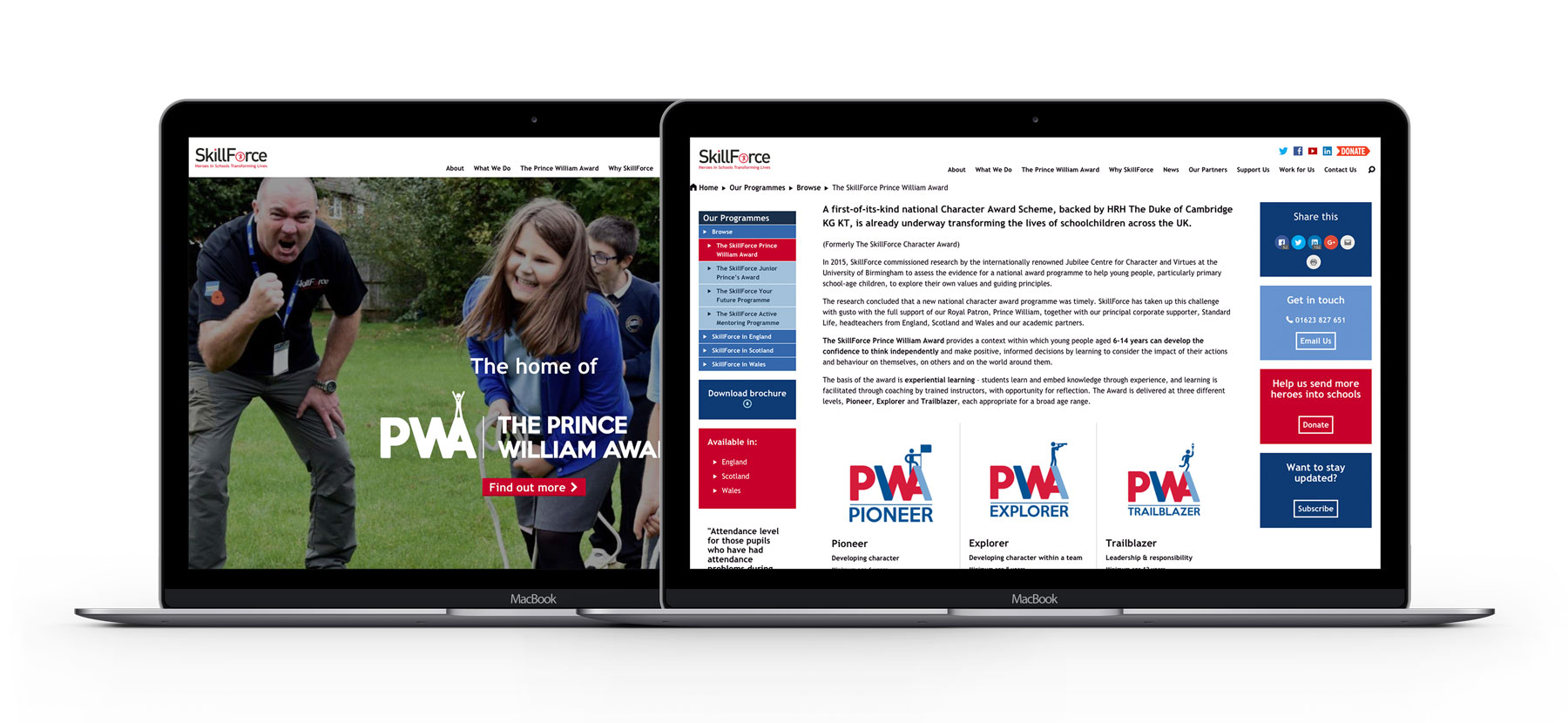
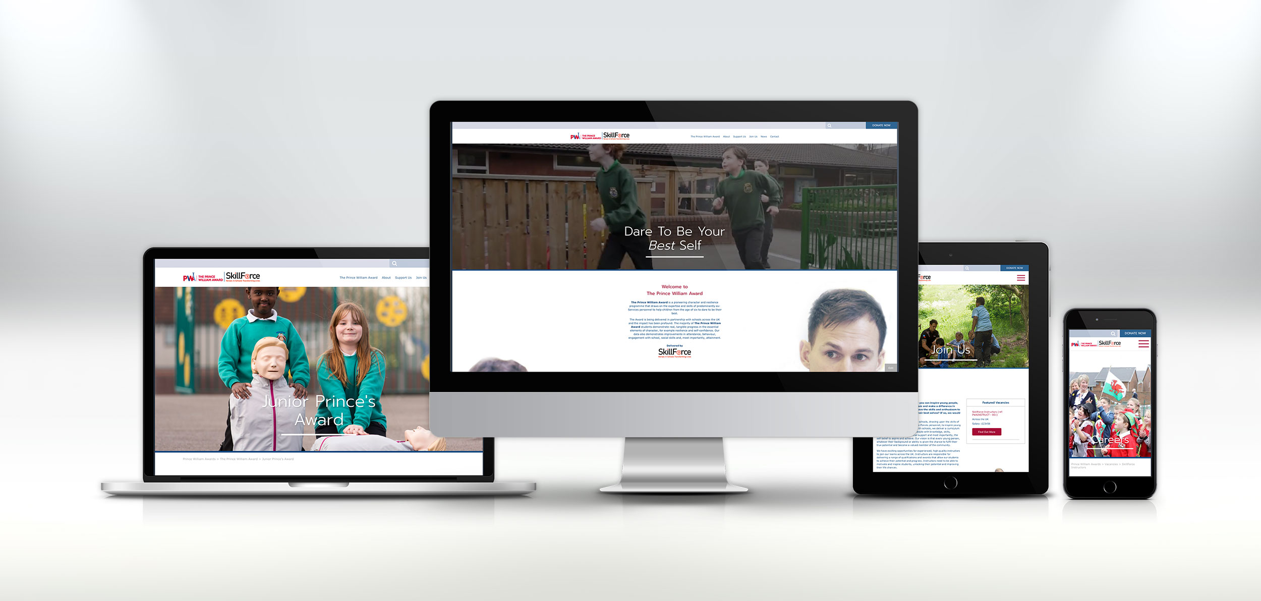
After months of hard work, we are thrilled to announce the launch of our latest website project. This is for The Prince William Award, which is delivered by SkillForce. The new site was launched on the 19th December 2017.
About SkillForce and the Prince William award programme
SkillForce was established in 2004 and is a national education charity. The programs guide young people towards becoming their best selves. Concentrating on resilience, confidence and getting young people ready for life’s challenges and opportunities.
As well as helping young people, they also support ex-forces personnel. Offering training and an opportunity to become instructors for the charity.
His Royal Highness The Duke of Cambridge KG KT became the charity’s Royal Patron in 2009. With the royal patronage, continued support can continue to serve the communities they operate in.
The Prince William Award program is here help young people build their character, resilience and confidence. The program runs in a school and runs against a structured curriculum. This features workshops, projects and reflection workshops.
The Task
The task was to build a new website that focused more towards The Prince William Award program, rather than SkillForce. We wanted to make more use of the brilliant imagery that SkillForce had available to us. But, also improve the user journey through the website.
The website was very cluttered, with lots of bulky chunks of text, which made the site hard to read. Also, uninspiring due to the lack of images through the website. We needed to make the website fun, vibrant and interesting for the user to read. At the same time delivering all the important information to the user.
The Website
A charity with such calibre and importance in society, it needed to stand out and be different from the rest. This is why we worked with the team at SkillForce to develop a website that not only fits their requirements now, but can easily work and expand on in the future.
The new website is fully responsive and seamlessly works on many screen sizes and devices. Giving the user the greatest view on the website wherever they are viewing.
We’ve extensively worked to declutter the website. Including moving all the information into easy to digest chunks and pockets of content. This allows users to read the information they need to without being overwhelmed. Also, guiding them through the pages to complete a relevant call to action.
Utilizing the great images that were available to us, we’ve made a feature of these in various sections throughout the website. Showcasing the work that the charity does, the children who they help. Also, the instructors who support SkillForce.
The website is built using WordPress and has a unique page builder. This can be used across all pages on the website. The website admin can use various elements to build custom pages for the content they have. This all fits the style and allows the admin to have the greatest flexibility within the system.
Before
After
We are looking forward to working with SkillForce next year. Continuing to build our relationship moving forward.
Who Worked On The Project?
Sophie, Lucy, Romin, Charlie, Polly


