Joe has spent the week learning the ropes with our design team. He’s kept us up-to-date with this interesting diary of his work experience. Read on to see some of his impressive work and learn about what it takes to be a designer. Congrats Joe! With work like this, the sky is the limit.
Day One
On the first day, Monday 1st October, I was nervous when I woke up that morning. I had never done anything like this before. This was a new step of me figuring out what I would like to do when I finish school.
I got into the office at 8:30 am with Sam Doyle, Head of Development, to be introduced to my place of work for this week. When the rest of the team entered the office, I was greeted by happy and smiley people wishing me the best of luck.
This week I was working within the design team made up of Dave, Adam and Lucy. When the design team walked into the office they made me feel very welcome and comfortable. All my nerves began to disappear.
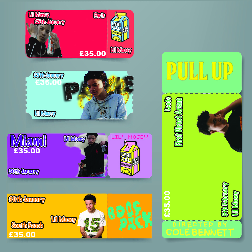
To start the week, we came up with the idea for me to create the promotional products for a musician’s tour, Lil Mosey. Firstly, I sketched out a few ideas on what I think would be the best way to sell a musical concert. After brainstorming multiple ideas, I decided to do promotional products for Lil Mosey who is an American rapper. I was thinking of designing a poster, tickets, lanyards, his personal tour bus and a mock-up of what his concert would look like on Ticketmaster.
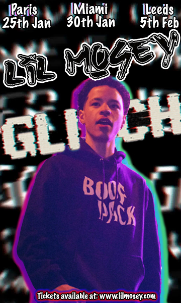
Then I loaded up Photoshop and planned out the dimensions of his poster promoting the concert. I went for the theme of “glitch” as in I thought this is what I could call the concert. I tried to make this as realistic as possible and personally, I can say it looks great! Secondly, I designed the outlines for the ticket you would be given when entering the concert. I added different materialistic colours to each ticket making them stand out, then adding an image of Lil Mosey on each ticket to address that it’s his ticket. On the ticket, I made sure it had the price in clear bold text so that it would stand out easily.
Day Two
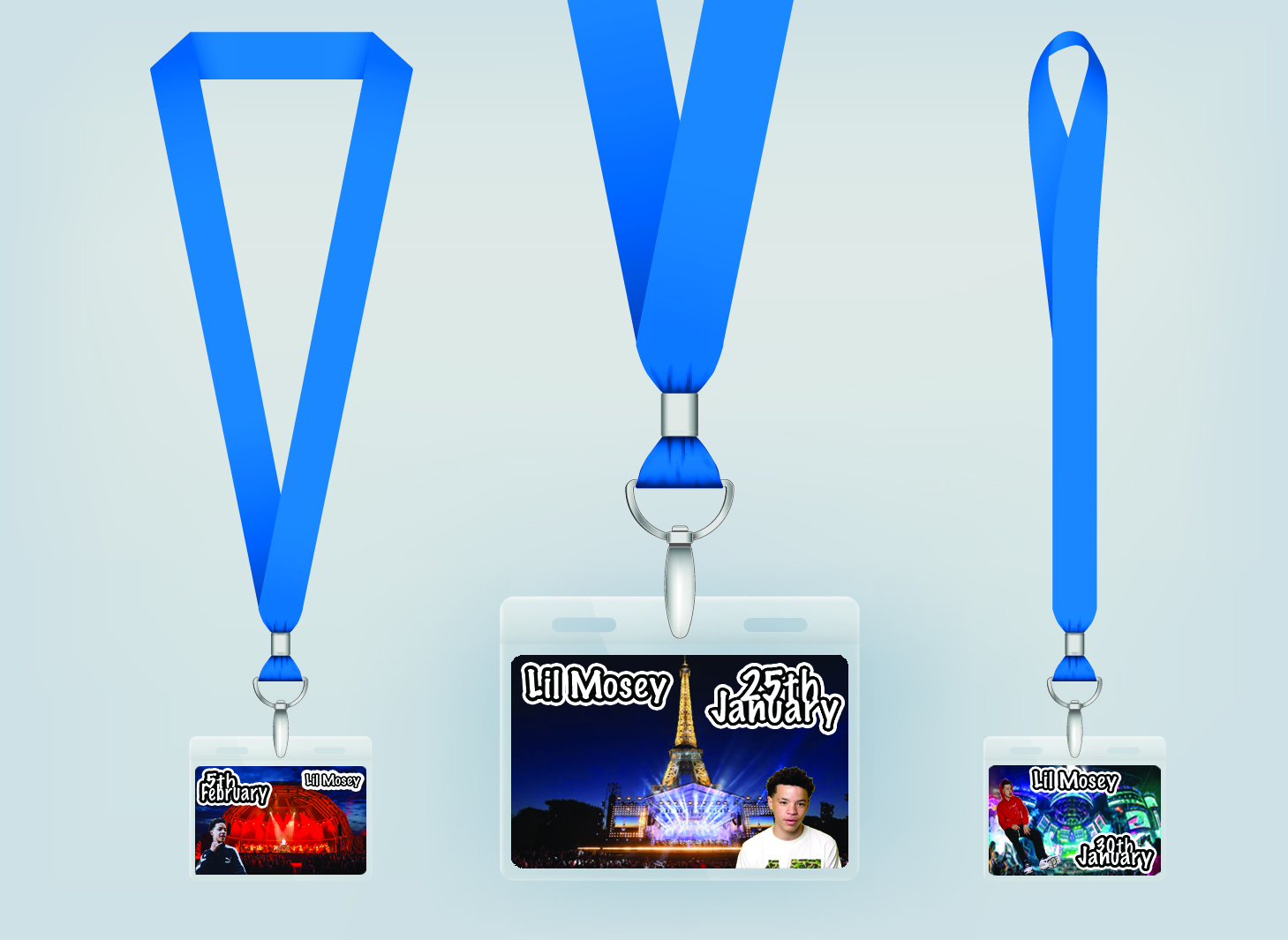
When day one ended I was buzzing to just go back into the office and carry on with the work I had previously started. I managed to get to Fifteen at around the same time ready to start and pursue the ideas I had sketched out. I started with designing the card that would slide into the lanyards, I designed three different potential lanyards, each lanyard would be used for a different part of the world Lil Mosey would be performing at. On the lanyards, I added a background layer of the three different stadiums he would be performing worldwide. I also made sure the lanyard had the date and month and including an image of Mosey on it. I skewed all the images to make sure it looked as if they were all originally on the bus.
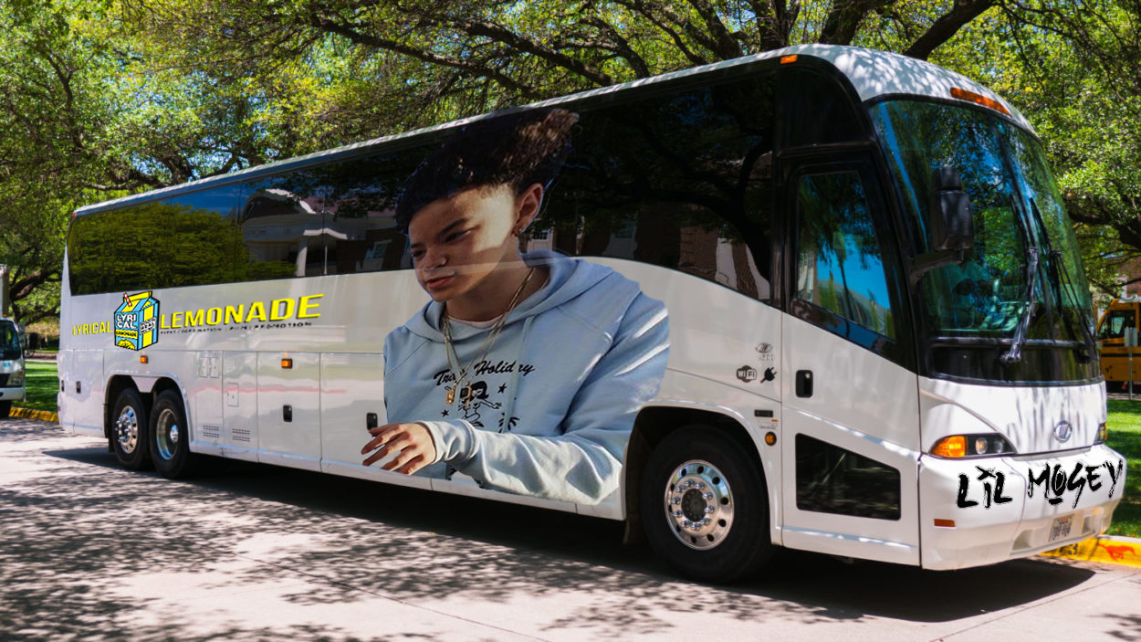
After finalising the tour lanyards, I started designing his personal tour bus. On the left side of the bus, I added an image of the music icons record label to show that this tour could possibly be sponsored by them. On the front bumper of the bus, I added his name in a graffiti brush font making it look edgy, representing the style of his music. Then on the middle of the bus, I found an image of the rapper to add to the design, I placed him on the bus with his head overlaid onto the window but he was a solid image. Therefore, to overcome this problem, I had to separate his body from the shoulders down and then managed to change the opacity of his head to give that ‘reflective window’ look.
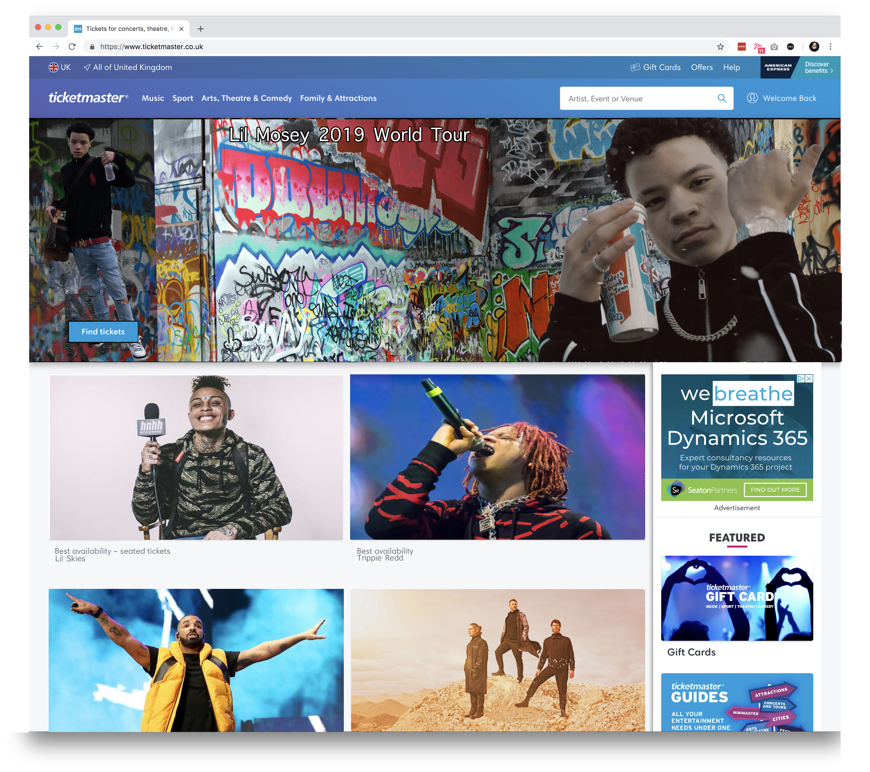
After creating the bus, I designed a Ticketmaster page of what the tickets would look like when being sold on Ticketmaster. I added a rectangular image of a graffiti background on the homepage of his Ticketmaster page and then added a few images of him to advertise that it is a Lil Mosey concert. I added a “buy ticket” button on top of the background, I also placed similar artists with the same genre of music in the recommended artists section to give it that realistic touch. This was the final product I needed to design to finish off the campaign.

Day Three
Day three, middle of the week, so far, I’m loving every minute of it. When I got in the office I thought to myself, this is what I could be doing this for the rest of my life.
After having a discussion with the design team, we decided that I could try and design my own clothing range including designing multiple logos picking one and improving it, then create animated banners.
![]()
Firstly, I put together a mood board full of existing clothing full of all different brands and colours to get inspiration for my own branding. I went into Photoshop and split an A4 page into four giving me four possible logo ideas after spending time on each individual logo I had to make the hard choice of which one to pick as they all looked as good as each other. After a hard decision, I managed to choose the logo I wanted to take and develop further.
![]()
Since I picked what logo I personally thought was the best, I then improved and progressed this more than the original draft making it look 10 times better. To make the chosen logo better than the original I added more features such as drop shadow, stroke, satin and bevel emboss. These features are just a handful of many that can make your work better if you use them in the correct way. With my clothing range being called “KING” I added a crown on top of the “K” to add to the theme and so the crown relates with the text.
Day Four
This day has been the best day of the week so far, Why?
I learnt how to make animated banners which I had never heard of before I stepped into the office. Animated banners are made up of a series of frames that form an advert on the internet delivered by an ad server. Designers manage to make them move so the clients banner can be more eye-catching and this will then lead to more purchases and website visits.
Lucy, a designer at Fifteen, spent most of the morning explaining how to make these animations, at first, I didn’t understand the process to create these. I then spent the rest of the day trying to create my own which was challenging but once I made one it boosted my confidence to then make more.
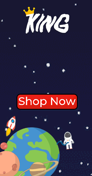
The first thing I did was to find the dimensions all the banners I wanted to create. Then I went for a space-themed background and added a slogan matching the theme “clothing range out of this world”. I added a few planets, an astronaut, a rocket and a shop now button to all relate with my chosen theme. On the very top of the banner, I added the logo that I chose to develop. After I got the background and the text figured out It was time for the animated banner to become animated!
I got all the text to slide in from each opposite side, I got the astronaut to look like he was floating in space also trying to make the planets moving.
After managing to get all the individual images to move it was just missing one thing, the rocket needed to fly. Within an hour I had made my very first animated banner as soon as I was happy with it, I made two more.
Day Five
Friday 5th October, my last day at Fifteen, I’ve enjoyed working here, showing everyone my skills in design and meeting all the smiley people of Fifteen. I finalised all my work so I can take it away with me and use it for my Record of Achievement and include it within my graphics coursework.
Everyone who works here is very welcoming and happy to help, they’ve spared their time to answer my questions, they’ve spared their time to improve my work.
Thank you Fifteen for a great week!