The Brief & Vision:
Actuaries.Online approached Fifteen to develop a website and forum that showcases a fresh and modern approach to the actuarial profession.
The system needed to be fully responsive, with special attention to the mobile experience. It needed to be interactive, dynamic and offer a new modern alternative to the existing websites that are out there at the moment within the world of actuaries.
Our key aims for the project were to:
- Raise awareness of Actuaries.Online
- Attract 3 core types of users – qualified actuaries, actuaries in training and those who are interested in a career as an actuary.
- Reflect the companies’, look, feel and modern approach.
- Have a website that is dynamic and visually pleasing.
- Support Actuaries.Online overall marketing objectives and inbound strategy
- Highlight key messages quickly and effectively; resulting in a positive engagement.
- Build a professional, modern website that is responsive and easy to use.
- Have easy navigation and a clear user journey.
- Build the forum and website within a Laravel framework, to allow easy modification.
About Actuaries.Online:
Actuaries.Online is a global meeting place for actuaries to discuss a range of topics around their profession, with a vision to provide a modern, professional alternative to the traditional actuarial websites. The most important thing about the website is that it isn’t affiliated to any formal bodies, so actuaries can discuss information freely.
What We Did:
Brand:
At the start of the project, we worked with the Actuaries.Online team to produce their new brand identity. We wanted to create something that was modern and fresh and stood out from the other established actuarial websites.
We chose a blue colour pallet for the logo, as this is typically a trustworthy colour, and falls in line with the professional nature of the industry. This was coupled with a clean and professional font.
Website:
When we started working on the website, the aim was to make it as clear and simple to navigate as possible. Using easy-to-read formats and elements fits the user’s intent and feed an updated UX.
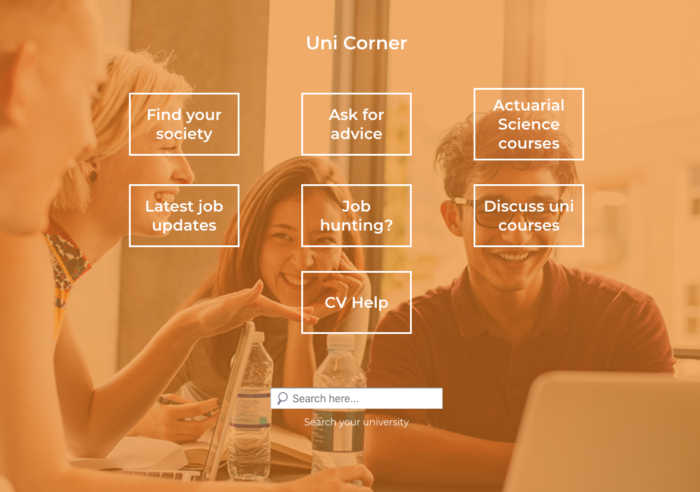
The website uses vibrant colours and a noticeable font. There is also a clear distinction between the various sections of the website for easy navigation. The updated layout allows the user to navigate through the site and recognise the specific colours for their specific sections. This helps the user locate themselves on the website as well as create a recognisable brand experience.
The site has a range of different features, including:
Community Forum:
The forum area of the website encourages users to get involved and discuss a range of topics from mathematical problems, to exams, personal development, careers and more.
Job Search:
The website has a dynamic job search, that allows the actuaries team to contact companies, advertisers and recruiters and enquire about jobs to post on their website. The vacancies will be displayed in a filterable search list, where the user has the ability to search by location, type of job, and keyword. Once they’ve found their desired role they can apply via the company website.
Advertising Space:
The website is a rich resource for advertising. The aim is to recruit advertisers for a multitude of actuarial services as well as parallel services and products.
Knowledge Base:
Users are able to access a bank of resources via a useful ‘links and publications’ area which link to a wide range of other actuary websites creating a single source of information.
We thoroughly enjoyed working with Actuaries Online. Have a look at their new site here. If you’re interested in how we can help develop your brand get in contact and we’ll help you create a stellar strategy.


