The Brief & Vision:
Ecova approached Fifteen back in March 2018 to help them deliver the following;
- a marketing insight workshop which will deliver a new purpose.
- a strategy, industry insight and trends report, analysis of current brand presence, social strategy, social calendar, SWOT analysis, 6-12month online goals and TOV documentation.
- An updated brand identity, brand guidelines, email footers, social icons, business cards and letterheads.
- a new website that takes into consideration the results generated from the marketing insight workshop. The site must also be mobile-responsive and built using the best UX design and development practices and techniques. The website needs to be built within an easy-to-use content management system (CMS), that gives the Ecova web team the ability to edit the website in the future.
The main aims are to:
- Position the business as the leaders in their industry.
- Increase lead generation through the website without reducing the quality, ensuring that leads more likely to convert.
- Improve conversion rate through an improved user journey through the website.
- Inspire and drive conscious choices in customers who want to improve their energy efficiency, cut costs and manage their carbon footprint.
- Help showcase the trustworthiness, credibility and friendliness of the team, helping the Ecova brand transform and evolve in the years to come.
About Ecova:
Ecova is data focused and use this information to help make their clients more successful through energy and suitability management. They use insights and data based on consumption costs and carbon footprints. This data is very accurate, employing a sample of thousands of utility and business sites across the globe. This ensures Ecova provide an unparalleled service that includes procurement, energy management, optimisation and compliance across a range of sectors.
What We Did:
Workshop & Brand:
When we started working with Ecova, they had just split away from the US parent company Engie, and they needed to define themselves within the competitive industry landscape. We worked with the Ecova team during a 4-hour workshop and explored the brand and what they stand for, why they do what they do and more. We ran through a range of activities with the team to fully immerse ourselves into the Ecova culture and mindset.
Following on from the workshop, we produced a digital and brand strategy document, which gives the team at Ecova a go-to resource to assist them with their marketing and company presence moving forward, covering the key elements of their brand.
While this wasn’t an exercise for changing Ecova’s logo, it was important for us to create them a brand language that stood out and was different from their competition.
We also worked on a new brand language, which complements Ecova’s colour scheme and look. This nuanced approach gave a subtle nod to the family branch but allowed Ecova to shine through with their own stand out identity. We created a series of concepts for Ecova to choose from and decided on a ‘Negative Space’ style concept, which is shown through a wall of binary letterforms, representing how Ecova gains insight to make significant business accomplishments through data. This concept can be carried across a range of images, colours and use different words to peak through the data.
We are currently working with Ecova to carry the brand language across their marketing materials, so they have a full range aligned with the new style.
Website:
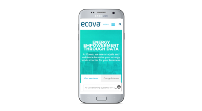
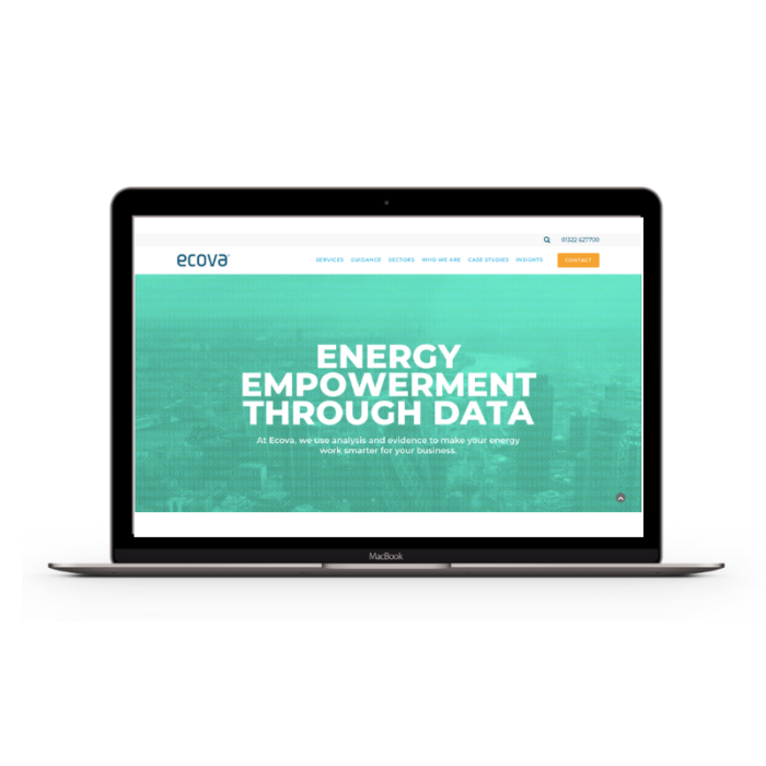
The Ecova website has been designed and built to cater to Ecova’s target audience, using modern website design and development techniques, as well as having a strong focus on the user experience throughout the website.
When a user lands on the website homepage, they are shown a large aerial shot of London with a moving data overlay alongside their core message. They are then taken to a tabbed area, where they can either look for the specific service that Ecova offers or contact the Ecova team for guidance around specific areas and challenges.
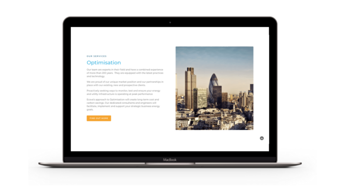
Across the site, we’ve used a parallax style of images which move across the screen as the user scrolls to bring a dynamic edge to the site.
The website design is clean and sharp, using bite-size chunks of information to make it easier for the user to process information and encourage them to get in touch at key points throughout their journey. This bite-sized format also makes it easier for users to engage with the site on smaller mobile devices.
The site uses a mega menu to allow users to access all areas of the website with ease, as well as allowing Ecova to expand their services in the future.
The website has been built using WordPress. The Ecova team have access to the website to post new articles and update content as and when they need to. We thoroughly enjoyed working with Ecova. Have a look at their new site here. If you’re interested in revamping your site, have a look at how our design team can bring your vision to life.


