Recently I stood on my prized earphones and killed them. Not just cracked them, but totally sent them into the next life. They weren’t particularly expensive earphones but they were good and the sound quality was amazing. I’m going to miss them! I listen to music at night to relax and when finished I simply toss the earphones on the floor next to my bed. Normally I spot them in the morning and place them out of harm’s way but this particular morning I’d slept in slightly so I was in a bit of a rush, I jumped out of bed and that’s when it happened, sad face!
I started to do a little research on the net for a replacement pair as the earphones I had stood on and killed were discontinued. And I came across a brand that I’d never heard of before. Normally I would stay clear of random brands, but the reviews that people were giving these guys were all five stars. In fact, they had over 70 five star ratings for this particular pair of earphones.
The earphones themselves were under £20, which is the perfect price point for me – not too cheap, not too expensive either. I thought I’d take the risk, and purchased them.
Good Branding on a Tight Budget
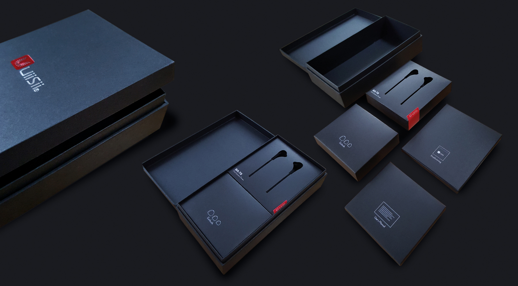
When the earphones were delivered, I was completely blown away by the design and finishing of the packaging. It was exquisite. Keeping in mind that these were budget earphones – £19.99 to be exact – they looked like a premium brand like Bose or Apple.
Every detail of the packaging was finished to such a high standard. Nothing had been overlooked. The box the earphones arrived in was made from high quality black board, and also had a sleeve around it. This was also black, but finished in matt with a red foil on the front for the company logo. Inside the box there were more smaller boxes, also finished in black uncoated card. It fitted so snugly into the main box that It was a task to actually remove them.
This got me thinking, and it’s the reason for this blog: how could a pair of budget earphones look so good and so expensive?
The agency who were commissioned into producing the packaging design for the earphones are obviously extremely passionate about design and different finishing techniques, as well as producing exquisite results on a shoestring. But how did they do it? And can the same kind of thinking be used in my world – graphic design?
To a designer, it’s a great challenge
Firstly, working to a tight budget doesn’t have to mean minimum design effort, restrictions or compromise. Think single-sided, one-colour flyer. For a designer, working to a tight budget means ‘challenge’. How can you get awesome results without blowing the monies?
One way is ‘do your research’. Look at different more cost-effective production processes and materials; after all these have a huge impact on the end result. Also, looking for resources that are already in place, like cutting forms and templates, would save on time and money, rather than have a finisher or printer starting them from scratch.
Another way to help keep the budget in-check is to always use your in-house capabilities. Outsourcing can be very costly – photography, illustration and app design are specialist areas, and having a team that can cover these specialisms is extremely useful and cost effective.
‘Skill swapping’ is another way that can help too. Use networking events to discuss your needs. Maybe you need an app design that you can exchange for a logo design and branding work.
There should be no compromise when it comes to design regardless of budget. As a designer, all the projects I work on are a labour of love, and hopefully this is reflected in the finished design.
Now it’s time to plug in those earphones – not only do they look great but sound great too. I’ll keep this pair off the bedroom floor!
For advice and support with packaging design for your brand, contact us here.

