There are many companies who rebranded to keep up with the times of many years of trends. Nothing more than I like is a real good rebrand. Even if it’s subtle!
Co-op
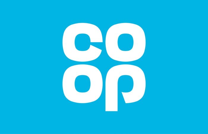
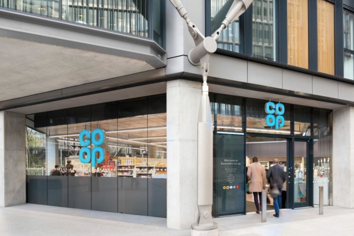
There are many companies who have even rebranded but have gone back to the past and revived their original brand, such as Co-op. The CO-OP went back to near the start of their branding – all the way back to 1968. All this change would see the supermarket chain change all their products across Food, Funeral Care. Is this a good idea or should it be in a staged approach?
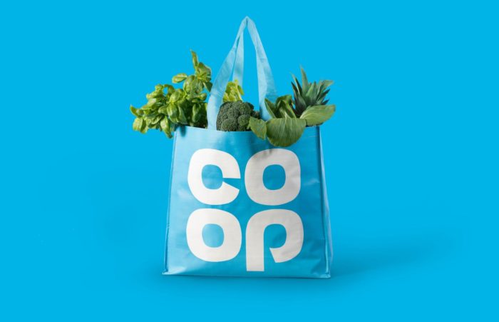
To my belief, this change of their roots has been two years in the making and is still happening now across all their sites up and down the country. The new/existing identity of Co-op has clearly been remastered to give them a unique typefaced identity – alongside a different stance to their original colour blue – making it stand out from their competitors who are mainly Green, Dark Blue or Orange. Along with this, there is a brand new typeface which has been worked across everything they sell such as their own brand products right through to their other materials such as self scan checkouts. However as this rebrand has taken two years, they are making sure that it’s not going to cost them. They have said that this approach would therefore take 3-5 years as this would impact everything including their head office signage, in-store POS and many other elements.
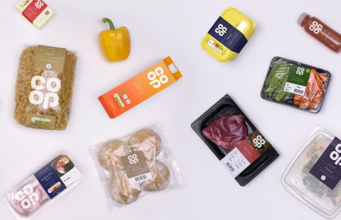
What is also clear that the rebrand that it effects is CO-OPs own brands. In fact they have at least 600 of their own brands on their shelves which will have the same style applied to them too. Thinking of the user experience within the supermarket I feel that this is perfect. Why? Because it uses less which then to the user is more. Knowing exactly what it is will deviate the user – or in this aspect, the customer from buying an alternative brand. These have been designed with simplicity – however some people might say the boring end of simple.
This is far from being simple because this is focusing on what is required to show to the customer. The background, the simple typeface used and the way they have layed out the labels and the packaging – I feel is just great design. All in all the entire piece has the right approach of taking the user back to their roots but at the same time having that presence of being modern. This is just something I have seen before where companies have gone back to their roots and not successfully executed, but I feel that CO-OP has.
Looking back towards the past for inspiration is one thing and others do look forward to create something new.
Channel 4
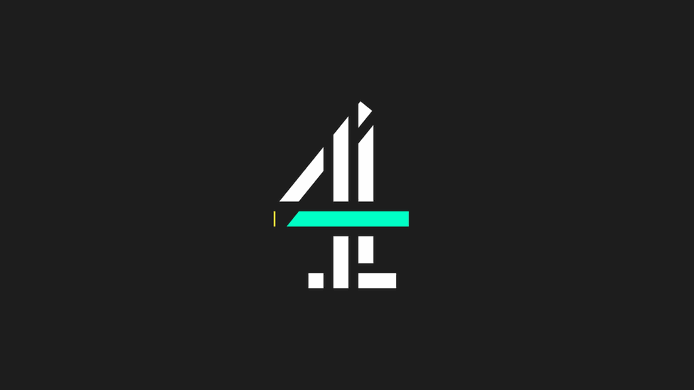
All 4 has a brand new identity which incorporate their online presence. A streaming ‘Playbar’ has been applied to the middle of their existing 4 device to show their digital platform. They wanted to get a slick feel feel across all their and to produce a new brand that will work with the current Channel 4 identities – but at the same time making it unique enough for people to recognise that this is for their online platforms
When you see the Playbar (the section that is is blue and yellow in the centre of the logo), it plays through acting like its a play bar which enhances the fact that this a streaming service. This is also a very playful way to introduce someone – keeping them informed directly with a bit of movement.
Channel 4 has always adopted an identity that enables the sense of forward movement and with this, they have a real strong look with their identity and with this Playbar running through the middle suggests a timeline of a programme. However they have done more with this – and used the shape to it’s full potential. Using moving parts, revealing images and more through a slick and smooth parallax movement allowing for a fresh new trend.
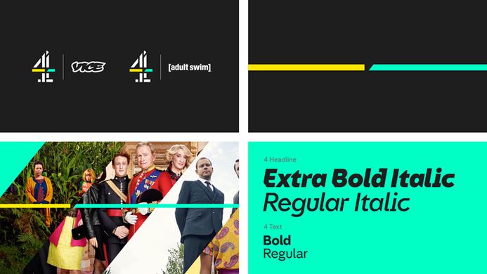
The colours they have adopted really stand out – gives it that feel of a rebrand. The powerful blue really comes across as energetic and digital whereas the yellow has that freshness and sharpness that unites the teal. On that, they have also gone with a feel of luxury/premium with the the dark grey. It’s not black, it just feel that is has that touch of class about it and offsets the two strong colours and then with the typeface – it all ties in well together allowing for a brand that has a simple touch yet have a sense of structure and purpose.
All the elements of this rebrand, comes together nicely and it’s been created to be a digital-first experience that I feel as a user is right for their target audience – and the digital age. The PlayBar is a feature in everything that they have produced allowing for a unique feel and for consistency across all their graphics.
Alice Tonge, Head of 4creative said:
“Our aim was to develop a more refined approach to branding for All 4, reflecting the improved product, which has become easier to navigate. The new All 4 branding is purposefully minimal, confident and sophisticated, providing us with a flexible toolkit that will bring freshness and energy to All 4. It is the final piece of the bigger portfolio rebrand that happened at the end of last year as part of the strategy to align all our brands around the master brand.”
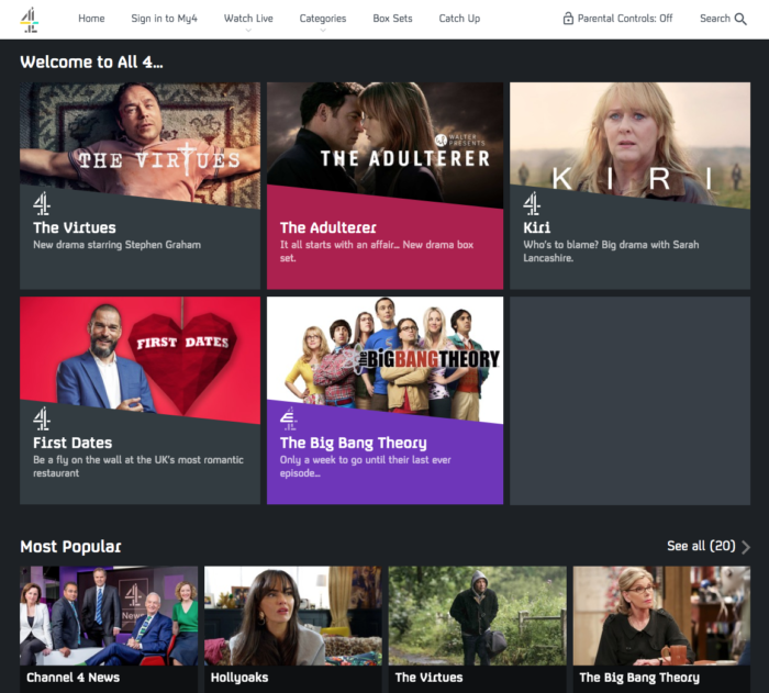
They haven’t just looked at the signage of the brand – they have looked in to the new look and feel of the app which has been rebuilt to be intuitive and really friendly to the user. They have also added to their app the functionality of downloading a programme and allowing the user to start a programme from the beginning even if it’s live which gives more power to the user – this is where the BBC was unique – but not anymore. The design of the new app continues to always impress me as it’s simple and you know what you’re doing without question. It’s ever changing and this reflects who Channel 4 are as a brand. They move with the times and doing it right. This service really now rival all their competitors.
4oD originally (in it’s own right was a great play on words) they have moved over to their new name of All 4 – which is exactly what it says on the tin. All Channel 4 under one roof. Even though it was anyway, but just keeping up appearances really.
The Head of All 4, Richard Davidson-Houston, has said:
“We’re innovating on all fronts. The classy new visual identity will help Channel 4 to stay front of mind in Video-on-Demand and the scaling-up of the All 4 + trial shows that we’re getting serious about a paid upgrade to the free service.”
“All 4 continues to grow faster than the market with its unique mix of live TV, catch up TV, box sets and our new content partners – such as Vice, Walter Presents and Adult Swim – give people even more reasons to choose All 4.”
Since Channel 4 launched their streaming service – they have introduced so many new and powerful things to show to their users and competitors alike that they are unique and here to stay such as Walter Presents.
So this means that people are taking a good look at this and thinking about what they have done is something special.
Purple Bricks
Only a few years old, Purple Bricks, founded in 2012 is an online real estate company that turned its first profit in 2016 but was then fighting allegations in 2017 that it was misleading customers. It has also recently expanded into the United States. So, whether the rebrand came about due to international expansion, a need for a new image following less than desirable attention in the press, or just the standard growth and maturity of a young company, the company has a new look.
In the real estate landscape, it can be very tempting to be very overt with imagery utilising rooflines, doors, or keys. This is moving away from that, and while it might look like a financial institution, the mark and colour visually distinguish it from competitors.
It will catch your eye. I would like to think that one could do interesting things with the logo mark as a border around a “For Sale” sign in a front yard.
From letterhead to digital marks on listings, it seems clear that the mark can be utilised in numerous applications.
The bold purple colour is the strongest thing the brand has going for it in this regard, but overall, it seems to be too muted in its form and font. When I first came across the brand, I wasn’t sure if there was some slang or obvious cultural reference in the UK to purple bricks that would help make this a brand with real meaning.
I’m not sure that happens to be the case, so I think the name is actually a bit confusing here. What exactly are ‘purple bricks’ and, in the case of this company, how does that represent doing things different in the real estate industry? A strong look for the brand with successful proportion bodes well. However, the font selection gives pause yet it isn’t enough hesitation to cause alarm.
This brand should stand for a long time to come, assuming that the business does as well. The logo is certainly simple, and without a doubt, there are many out there would naturally think that it is too simple. Clever simplicity is a very difficult thing to achieve. This logo does a fairly good job, the four diagonals line up, and that adds unnecessary complication to an otherwise simple mark. While it isn’t perfect, the mark is a large improvement. While the new mark might have the appearance of a financial institution, at least that usually conveys trust and strength. The original mark looks cartoonish and game-centric.
So there are many ways in a brand that can rebrand, but all in all, most of the time a brand does a rebrand, it’s to be with the times. At Fifteen we haven’t shied away from that either and our branding truly represents us and our beliefs.
If you feel that you need to rebrand and make something more unique, or even haven’t got a brand and you would like to make your vision a reality then Fifteen can help. Anything you have we are the agency for you. Get in touch with our friendly team or give us a call 01159325151 and we will be here to help you achieve your goals and visions.
