Contact forms are one of the most useful and important parts of a website. The reason being they help you to connect and win leads. At the same time, from a user’s point of view, it can be the most boring and time-consuming part of a site.
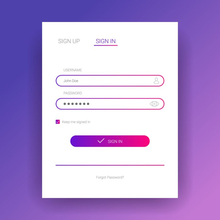
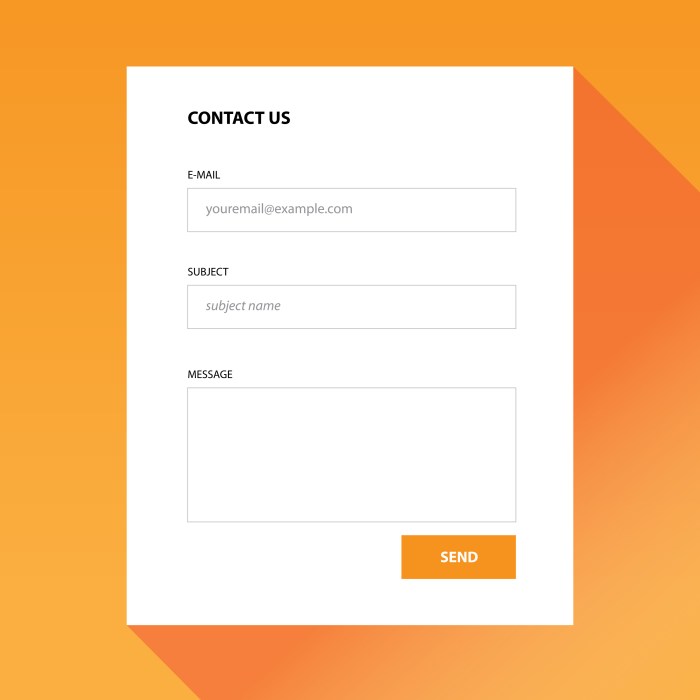
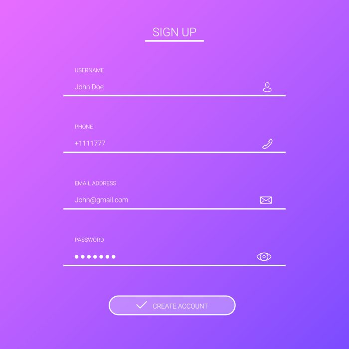
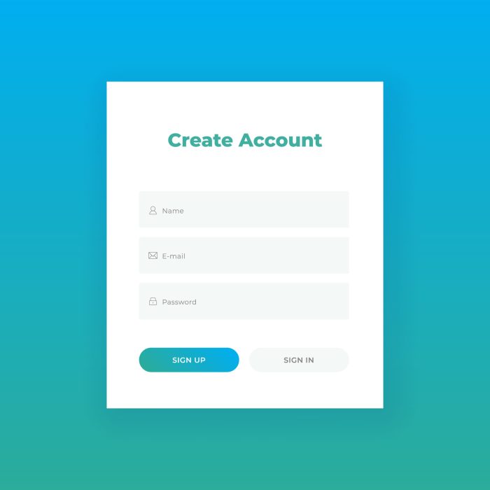
You’ll see forms like this on a contact page of a website where a user would get in touch or enquire by filling a short simple form. In some cases they are much longer – these are normally registration forms.
Studies have shown that contact forms don’t convert that well. But everyone has a form of contact us page on their site, so why do they have a low conversion rate? In many cases, this page, in particular, is the afterthought.

This page has another name, rather than a contact page it’s a call to action page. You need to make sure it’s not an afterthought.
We will show you the 10 ways to make them a hit. I love a form and if your’s isn’t working then it’s time to change:
Copy
Copy is king here. You should explain to your users what they are meant to do. Lead them into the form. Explain to them why contacting you will be the best option.
Don’t beat around the bush – make a statement and tell them to contact you. However, don’t overload a user with lots of information. The true purpose for a contact page (call to action between you and I), is a page that should be quite direct. Information that’s not explaining why someone should contact you, then it should not appear on the page – keep it simple.
Overcrowding
Honestly, any form should keep to a minimum. Reduce the number of fields that a user has to fill in as this will increase conversion.
MarketingExperiements have shown that a form that consists of 5 fields gives a conversion rate of 13.5% over a form that is on the same page but with 9 fields having a rate of 10%. Therefore, shorter forms can increase your conversion. However, it all depends on what the form is and where it is too.
Engagement
A contact us page should have one main form. Having others will make it look like you’re desperate for contacts. But what it should also include is other ways of engagement. What if someone doesn’t want to fill in the form? Sometimes people don’t want to speak to someone. So why not add a contact number and email address or live chat service.

Another form of engagement of a contact us page is adding in a map with your address and social links.
Giving your users options to contact you makes for a more comfortable experience where users can choose which method giving them the control without actually giving them control.
And most importantly, when someone has filled out the form, give the user a reassuring thank you and you’ll be in touch. Maybe highlight the time you will respond giving them another friendly user experience.
Converse
A contact us page has other purposes other than contacting you. It is also the perfect place to show off your social feeds.
Allow the user to be in the moment and want to be there. It is normally the page that someone visits when they want to get answers about you as a business. Make them feel welcome. Give them something to convert to. Maybe show an image of you or even your team, give the users info on who they will be having a conversation with – if they end up meeting you face to face. It will make them feel like you already know each other.
Inspire
A contact us page along with its form, should invoke trust and always inspire confidence allowing your users to contact you and feel comfortable in contacting you. For example, if you’re offering a great menu and a user is there to book a table at your restaurant – immerse them into your world – show them a picture of your food – it should solidify their booking.
Make it one-sided
Try and make your form with its fields sit into one column. Forms that follow a vertical path allow a user to easily and naturally flow through the form, especially if you’re tabbing through them.
Keeping the form on one column allows for better site responsiveness and provides a more seamless user experience.
Labelling
Google loves mobile. It’s why it’s called Mobile-First Indexing. So when thinking about forms, especially on your contact page, think how they will appear to your users on a mobile device first – but still have a desktop device a close second.

Here’s the trick, try and use the label of the field ahead of its field, therefore, you’ll be able to display information in a field way before a user scrolls towards the field. However, if a field label, (strangely some folks practice this) is positioned below, a user could get stick in a loop of having to scroll up and down to see what the field label is.
There are clever ways to clean it up even more below.
Buttons
These are what a user clicks on to finish the form. If this is not clear then how do you think a user will feel if they are not sure how to submit.
Designing a button can be the forgotten rule in a form. It needs to be visible. Think about using a colour that contrasts. Make it so it tells the user it’s the end and home into the copy for this button too, tell the user exactly (in a few words) what will be happening when they hit it.
Then once complete make sure you visibly display a validation message on completion of the form.
Validation
A study from Formisimo has shown only 60% of forms use inline validation and when asked, “When you fill out a form, do you want to be told about mistakes as you type?” 90% of users said yes they would.
This saves so much time allowing the user to quickly enter what they need to do and enquire quicker. These little effects can increase conversion and have huge ramifications.
Lastly – That Annoying Asterisk
There is so much talk about this small point – I mean star! Some experts say you need to say which ones are optional and also which ones are mandatory. My advice is to stick to one. If you want to declutter a form then mark the ones that are optional as optional.

Yes, most people know what the small red star is next to the field title is, but does everyone know?
The number of the optional fields within the form really should be kept to a minimum. The minority should be the ones that are marked. So if you have 10 fields and 9 of these fields are needed to be filled out, then marking the one that isn’t mandatory as optional makes perfect sense.
To finish up…
Make a form especially on your contact page spick and span, using proper field labels, using one column and the use of proper validation and buttons you surely will see a page that will increase its conversion and also be a hit with your digital team.
If you need a hand updating your site or would like to know how to optimise a page for conversions contact us today. We have decades of experience creating web forms, websites and digital strategies specifically tailored to your needs.
