Instagram is a highly visual app, with beautiful videos and photography thriving on the platform. One thing that is overlooked by many is the visual impact of your profile grid. A strong, visual instagram grid is often used by influencers and large businesses, so what options are there?
Essentially, the layouts are separated into two categories:
- Colour Schemes
- Patterns
Instagram Grid Colour Schemes
Colour schemes involve posting images with similar colours and filters, often gradually altering the colour scheme over time.
The two examples below show different types of colour scheme tactics, one sticking to a grey/white pallet and the other gradually changing, from orange to yellow in this instance..
As you can see, it has a great visual impact and people visiting the pages will immediately be able to see that the accounts are run with a lot of thought behind the posts.
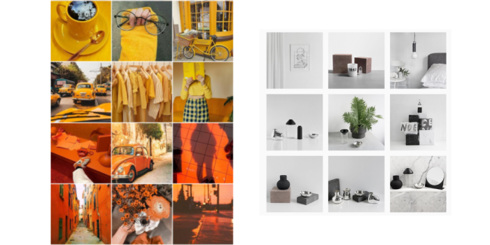
The problem with the first example for a business is that not only does it take a lot of planning, it also requires the imagery to match the theme, meaning reactive posts are very limited.
E.g. say you want to get a post out about something that just happened such as unexpected business news that you want/need your customers to be aware of. Unless you have an image in the right colour scheme, it will look out of place.
Instagram does offer you the option to archive past images, which basically hides it from the grid. That does however remove it from followers’ views.
Instagram Grid Patterns
Patterned grids come in many shapes and sizes and at Fifteen we have incorporated several different types.
By incorporating a pattern into your instagram, you can tactically plan for key messages to tactically stand out to profile visitors.
Before deciding on what pattern might suit your business, you have to consider what resources and content you have. Instagram is primarily a photography app, but some businesses may not have a great library of photography nor strong photographers at hand, so a pattern that allows for more graphics may help.
Other businesses may have plenty of photography, and patterns can be shaped without the use of graphics and text.
A simple example of an effective pattern is what we use for our client Appliance People. Every other post features a graphic with a product or an offer and due to the strong brand colours, the profile stands out.
We also used this for the World CBD Awards, which helped create an attractive feed without any photography at hand until the ceremony.
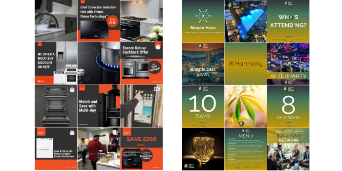
By changing from every other post to every third, you get a straight line layout as we used for two other clients:
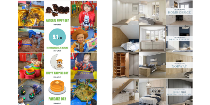
You can also keep your posts in columns with rows in between, like we have done for our own Instagram, where we post a graphic every 9 posts, leaving two rows between each.
A more advanced layout was used for Sea CBD, where we had several matching columns, with a row gap in between each. As you can see, the page also has a blue colour scheme that is used throughout.
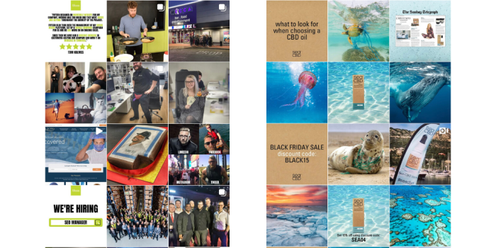
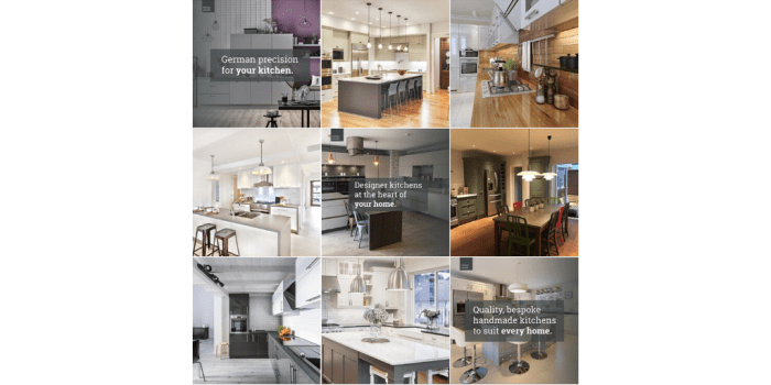
Diagonal patterns can be created by posting themed images every fourth post, like we do for Kitchen People.
Avoid
Every now and then you come across an Instagram grid with a really cool layout and you think “I want that”, but when you think it through it’s actually a bad idea.
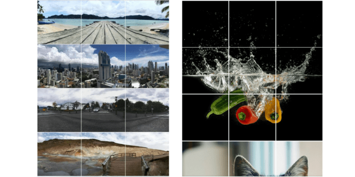
One of these examples is by posting three or more posts in quick succession, in order to create an image using multiple posts. By creating an image including a whole row, you’re not only committing to posting three posts at a time because the grid shifts after each post and thus splits the image across multiple rows.
You will also run the risk of losing your current followers, because no one wants to see multiple posts from one person in a row, let alone posts that only feature a small part of an image. In some cases people create an image of 9 posts or more, so imagine if you followed an account and had to scroll past 9 parts of one image and then have to face at least three in a row for the foreseeable future…unfollow.
Creating a great Instagram feed can be time consuming and complicated, so if you want your page to stand out, get in touch with us.
