REQM (Religious Education Quality Mark) works with the Religious Education Council of England and Wales to acknowledge and celebrate outstanding RE in education.
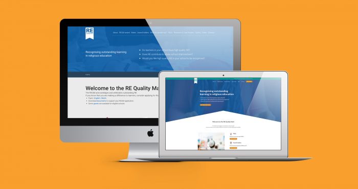
The team at REQM approached us to take a look at revamping their previous website into something sleek and modern which could pave the way for the future of the awards programme.
About REQM:
The RE Quality Mark (REQM) is an award that schools can apply to achieve based on their RE contribution to those who are in education. The team at REQM believes that RE provides learners and teachers with a safe space to explore the important ideas of what it means to be human and learn about religion and worldviews.
The quality mark has two core purposes; the first is to recognise good practice in RE within schools. Second, is to provide a powerful tool for the development of the programme within the school. The mark helps emphasize the importance of RE within a learning environment and makes it known to prospective students.
What We Did:
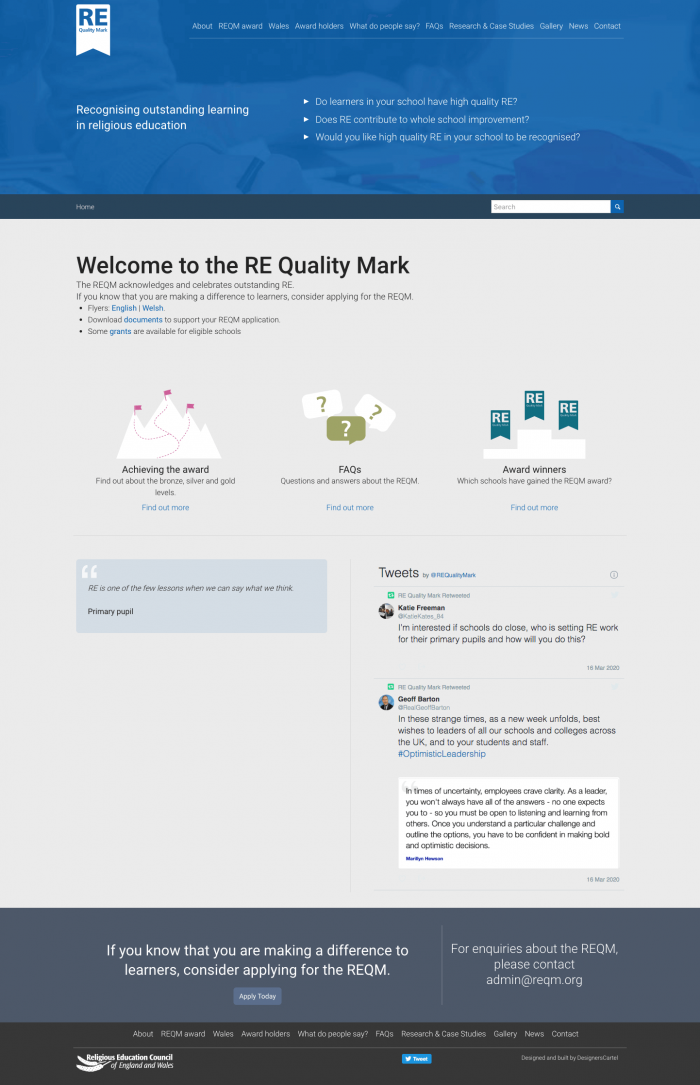
After meeting the team and planning out what they wanted to gain from the new website, we created a new sitemap for the site, allowing users to be guided through the process, and find information easily and quickly.
We then went onto to produce a design that utilised the current branding but gave the site a modern and clean look that feels in line with web design trends.

Images on the site were important, as they needed to remain neutral to signal a wide variety of religions and not pigeonhole the award. This heavily influenced the visual style – throughout the site, you’ll notice that we’ve used stylized images and iconography-based graphics to demonstrate the core information and important areas.
The site also has some functionality behind it, with the creation of an award holders map, where uses can find other bodies across England and Wales who are part of the REQM community. This map also allows the REQM admin to send out the certificates to the relevant members of the school.
REQM previously handled their applications using a Google Form, on the new website, we implemented this on the website itself so it creates a streamlined process for users from start to finish. This keeps users on site so they never have to leave the website.
Allowing the client to edit the website, was a vital element of the job. We built the site using WordPress as the CMS system. This platform has a range of flexible components which allow the client to build on the site moving forward and makes it super easy to add any future functionality or sections within the website.


This project was a joy to work on, we are really happy to see it go live, and we can’t wait to work with the team again in the future.
If you would like to find out more about our web design and build services or are interested in digital marketing, contact us today. We’ll supercharge your website and maximise your visibility.
What they had to say:
“Fifteen Design has been an incredible design and development partner. They worked diligently to a difficult brief and produced a spectacular update to a tired website. The team were attentive and responsive throughout the process, and any issues that came about were swiftly resolved. The price was exceptional given the amount of work that went into refreshing our site. You never really know what quality of service you’ll get when searching for a provider through Google; but based on the excellent results, we will putting a recommendation to our board to continue working with Fifteen in years to come. Thank you in particular to Sophie and Martika who worked so hard to make this a smooth and enjoyable process.” Joshua O’Loughlin, Communications and Executive Assistant, Religious Education Council of England and Wales
