Websites are the face of your business. With the past year of lockdowns behind us, businesses of all shapes and sizes have come to realise that to succeed you need a digital presence. Luckily, we’ve got a bit of experience in this and want to highlight some of the warning signs that your website may be due a refresh. Whether that’s a full makeover, or a tweak here and there, we’ll list 4 of the most common in this article.
4. Slow load speeds
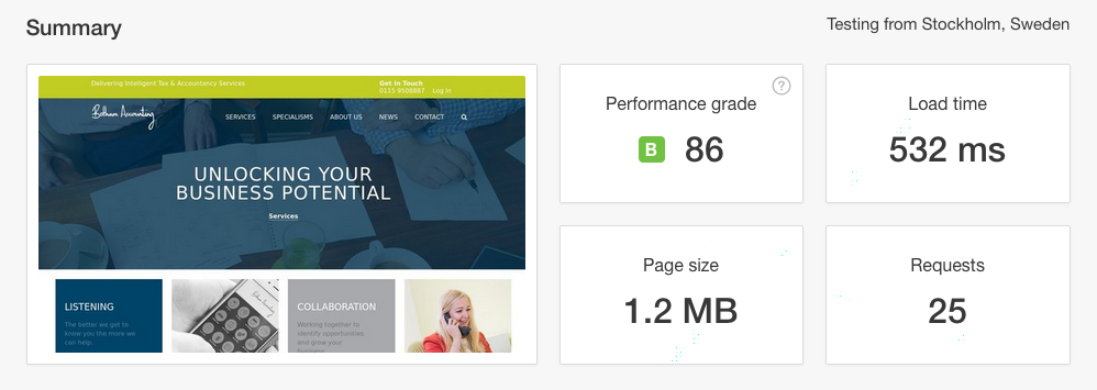
Unfortunately, an older site is often a slower site. If your site is slow to load it may be due to a number of things under-the-hood which can cause slowdowns. Whether that’s external linking to broken resources (such as CSS, JavaScript and Images) or simply that the way it was built is storing redundant data, which could be causing a bottleneck somewhere. Large image and video files can also be the culprits.
Sites also need to keep up with user demands and the industry as a whole. Faster Wifi, quicker processors in computers and mobiles, and advancements in web browsers means that as a society we expect pages to load faster. Websites pages need to load in milliseconds now to keep the attention of the user, the longer the load time, the more likely they are to close the tab.

3. Extra Unnecessary Content
Websites that have been around longer tend to have accumulated more virtual clutter. We’re not talking about the old blog posts you have. Some of the best-performing pages for SEO can be older blogs that are rich in keywords. The problem pages are the ones that no longer serve a purpose. Maybe a page advertising a one-off deal, a competition page, or a service that is no longer relevant to your industry.
2. Old fonts and out-dated graphical elements
A website’s design can often show its age. A few years ago it was the norm to have a lot of fancy graphics and imagery on your website, but the web has moved on to more of a flat design which relies more on colour than images. Updating your web design allows you to optimise the site for user experience while staying up with the styling users have come to expect from a modern website.
1. Responsive Websites
Fixed width websites are yet another relic of the past. They came at a time where web developers and designers did not have to worry about the mobile web. They had a content container which had their content inside it and did not have to worry about how the screen size affected it.
Since then we’ve moved on to a more responsive field of view… which can only be fixed by responsive design. That is, where you resize your browser and the website responds to fit the window or the device’s screen.
A few years ago Responsive Design wasn’t such a big thing as it is today, so we had websites mobile sites on .mobi domains, for those lucky users of the latest phone technology which came with WAP in-built. However, times have changed and so has the web. Responsive Design has prevailed over separate Mobile and Desktop websites, and we think the web is better for it.
For some brands, it may even be beneficial to create a bespoke app for their service offering. Whatever the case, having a website that responds to the user is absolutely key and one of the biggest signs that your website needs a refresh.
In Conclusion
These aren’t the only telltale signs that a website is outdated, but they do stick out like a sore thumb if you know what to look for. If you would like your website appraised or want to find out about how we can supercharge your site get in touch with the Fifteen team today.
