Photography and Images are great ways to punctuate your website, and often a necessity in todays web. Images help break up the content and, if you’re running an e-commerce website, show off your products.
However, Images on the web have a nasty side. Due to the advances in todays camera technology, that amazing photo you took to show people on your websites Gallery page could be upwards of 4 megabytes. To put this in perspective, as a development team we try to keep our total page size (that is, the combined size of everything on a page) to below 1 megabyte.
The trouble is, you don’t have to be a professional photographer to take decent photos anymore. Sure, there are massive benefits to using a photographer if you want those pixel perfect images, but if you are just wanting to share a quick snap on your website, your phone is probably your go-to method of photography. However, even iPhone’s have advanced so much that the images they take can still be upwards of 3-4 megabytes, ranging between 3000 and 5000 pixels in width, for that HD feel when displayed on it’s smaller screen.
What’s wrong with that?
These image sizes are quite simply not needed for the web, and they do more harm than good. The higher up in quality you go, the higher up in file-size you go. The higher up in file-size you go, the longer it takes your web page to load. This has the unwanted effect of causing users to click off because it’s taking too long, and it also can mean that search engines penalize you in the rankings because page speed is a factor in most algorithms now.
So, I’m sure you see how important it is to make your images web friendly. Well, fear not, there are several tools we use here at Fifteen which will make your images look great and also be friendly for your website. You won’t need to compromise on quality versus file-size either.
Resize Images
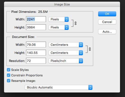
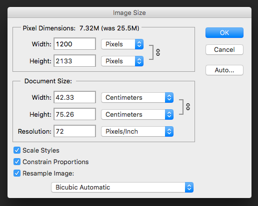
I personally like to resize my images to a maximum of around 1200 pixels wide, if they are larger. This is based on the average screen size being around 1200 pixels wide, and we use various methods in the creation of our websites which will ensure that the images will scale gracefully even on larger screens as a part of our Responsive Design strategy.
Photoshop Save For Web
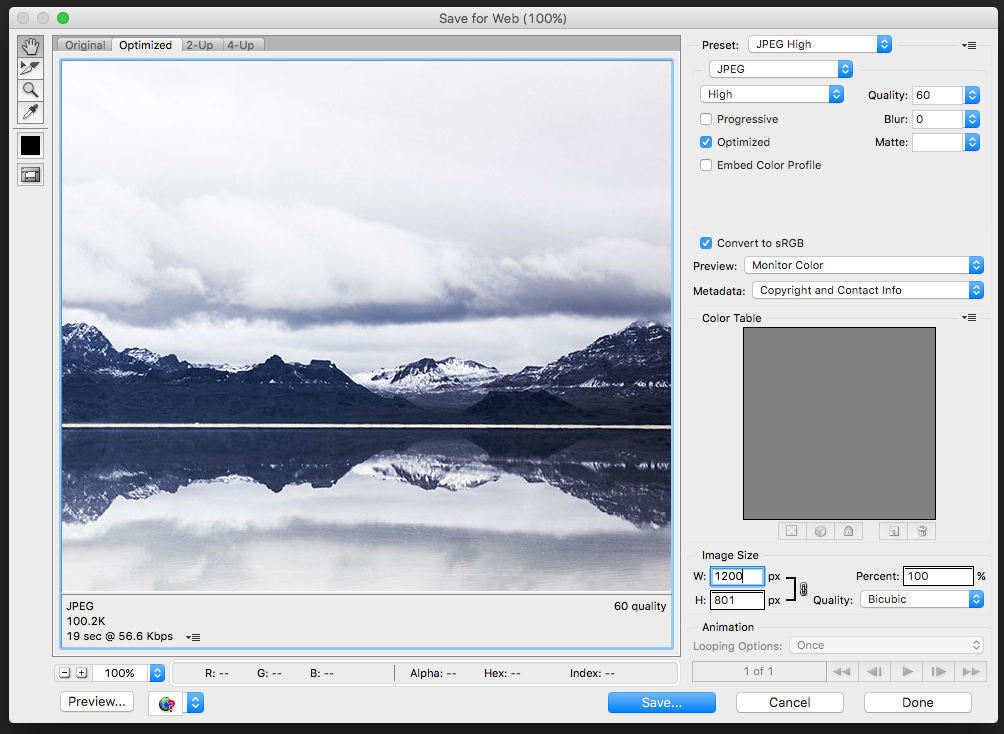
Adobe Photoshop has a Save For Web function, which is very useful when you are outputting images for the web. The feature does what it says on the tin, and it allows you to pick the best possible option and shows you the file-size of the output image even before you save it.
Save for web also lets you resize, but I like to do this beforehand as it makes outputting the image just that little bit quicker.
ImageOptim
We also use a tool called ImageOptim. It’s a free tool for Mac which will optimize the images, and we use this usually after we have also resized and output the image for web. That’s usually the final stop before putting the images on the website.
How small is small enough?
As I said, you never really want to sacrifice quality for file-size. Personally I aim to keep my images below 250kb as a maximum, and it all depends on where the image is shown on the website. If the image is a big hero image which is the first thing the user sees, then yes, you’d want that to be the highest quality it could be at the best file-size it can be. If that means it is 250kb that to me is an acceptable compromise.
Hopefully I’ve shown you some interesting tools on how to make your photos and images web-friendly and maybe even speed up the loading times of your site.


