I have written this blog as a reply to anyone asking the question:
What sized images should I upload to my website?
And while the answer can be very vague (technically you can use any image), it should meet some requirements of the design to get the desired results.
Building the hole that the shape fits into
Almost like the toys we played with when we were one year olds, fitting an image to a design is a lot like fitting a shape through a hole. The designer will take into account the assets/images available to them when designing the website, and make best use of what they have however a decision has to made. Will it be a square? Will it be portrait? Will it be landscape?
When a decision is reached, depending on the answer is how I (Chris, the Web Dev) will build the image space into the web page.
But there’s a caveat, and back to the metaphor (putting shapes through holes) a wrong shape in a wrong hole can ruin the flow of your web page! Now let me explain how to avoid this.
The golden rule of responsive images:
Either the image must be the same aspect ratio, or it will be cropped/white space will be added to make it fit.
To elaborate, if the hole of the image is square and you insert a landscape image, for it to fit the height, the sides must be cut.
Cropping
We’re using a background image, positioning the image vertically and horizontally central.
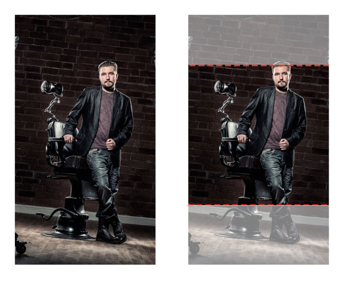
This landscape image on the left is the original, but to use it in a square space requires us to remove a section on the left and right in order to make it square. This is cropping.
Adding white space
But now look at the result if we didn’t crop the image.
We have to squish the image in, leaving a white space at the top and bottom of the image. You may have experienced this if you have an Instagram account and have tried to upload a landscape/portrait photo.
So let’s try that again with a portrait image.
I’ve lost my head! And this not desirable…
What is an Aspect Ratio?
Often the designated space will be a set aspect ratio so that when the gets wider, it also gets taller and doesn’t stretch.
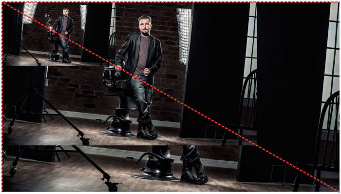
16:9 (landscape)
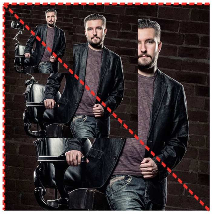
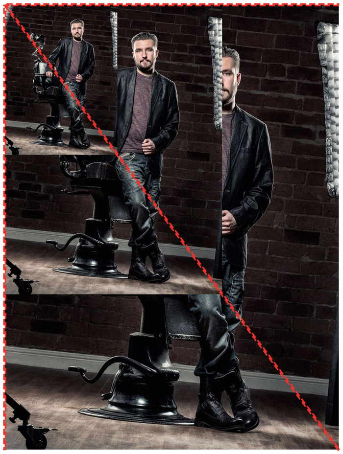
You can see the image gets both taller and wider so the shape is kept even when resized.
1:1 (Square)
5:7 (Portrait)
Stretched
If the image does not keep its aspect ratio, when it’s resized, this is what happens:
But what does it all mean?
When you’re uploading an image to your website, the designer / content managent system / web developer presume that your image is landscape, portrait or square. You can tell either by the image you’re trying to replace or, if there are more specific requirements, there will be a description with the “Upload Image” field.
If the image does not meet the requirements, then it’s a given there will either be cropping to fit some of the image into place, white space to allow all of the image to fit (but may be tiny) or it may just push your content out of the way and make it unreadable.
There’s always the opportunity to try it out and see what works best. If you’re not happy with the result, resize your image.
Need help with your images?
Contact us and let us talk you through getting the best from the images you have.


