When designing for a brand you will always have to consider how to choose a font which will work for both print & web. So what would help guide you to your choice of font that work’s for both?
Whats the difference between web & print fonts
The main difference between fonts for web and print are that web fonts are optimised to be read on screen. This is to do with the resolution of the screen. Screen resolution is usually 100 pixels/dots per inch (dpi) whereas print would be normally be around 300dpi.
Traditional fonts designed for prints were designed with ink traps, spaces inside and some letter from the same family would be different depending on the font size.
Points to consider when choosing
1. Size
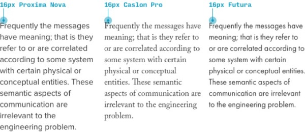
Standard sizes for print would typically range between 10 – 12 points, as compared to screen where font sizes would range from 15 – 25 pixels. This is all good for some fonts, but there are certain fonts which at these sizes can appear to be a different size due to the way they are designed.
When this is the case experimenting with different sizes to achieve the best for print can mean that sizes can go below or above 10-12 points. Most printed material such as magazines, newspapers etc can be seen printed below 12 points.
When considering sizing for screen, fonts can be made bigger due to distance to the screen, but considerations should also be taken for mobile devices which are held at arms length.
2 Font Characteristics
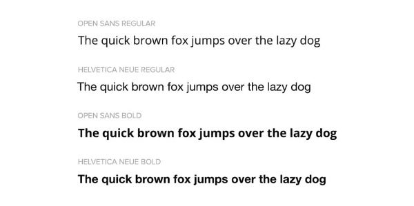
Serif font or Sans Serif Font? When designing for print, Serif or Sans Serif fonts both work for body copy, but when considering a font for body text on a computer a Sans Serif font can work better over a Sans Serif.
This can also depend on the font chosen, what characteristics does the font have, so the choice of font for a large amount of text needs to be considered carefully.
Some print fonts will have webfont variation, but even if they don’t some fonts will still work for both or there are fonts which are similar.
Google fonts similar to Helvetica
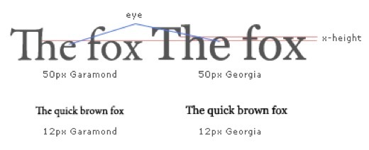
Garamond is a good example of where an alternative web version of a font would be more suitable. Using Georgia as a replacement for Garamond on screen can help with eligibility due to the more defined characteristics of Georgia compared to Garamond.
Finding the best fonts for web & print.
With the number of fonts available to download from sources such as google fonts, dafont.com and font squirrel which work for both print and web can become quite daunting for designers, especially with a majority of the fonts being dreadful. But there are some good examples which can be found. Below is an example of some of the most popular available on Google Fonts.
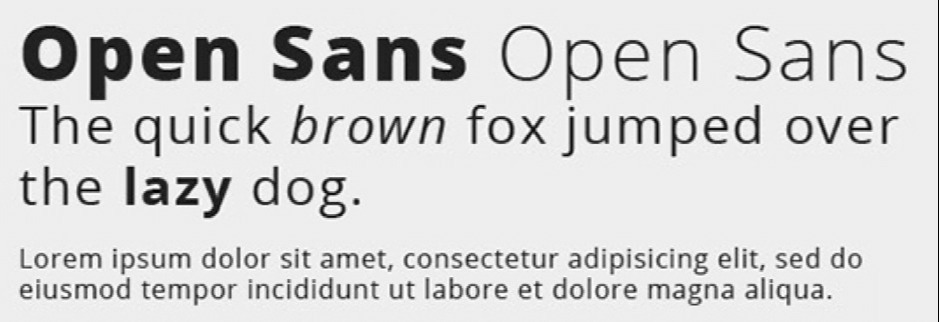
Open Sans
Open sans is a sans serif typeface which was designed to be optimised for web and mobile devices, with its clear legibility it can also be used in print with the same effects.
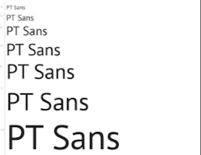
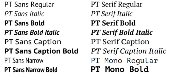
PT Sans
PT Sans (Public Type) is an open source font and is one of the most popular fonts used on the web.
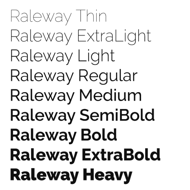
Raleway
Raleway designed to be clear and legible, popular on many websites and available in 18 different styles.
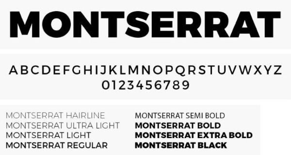
Montserrat
Montserrat is now becoming one of the most popular fonts for websites and also in print. With its clean design make it not only easy to read but also one of the more attractive fonts available.
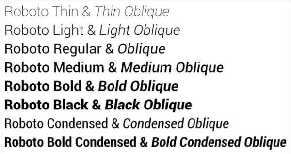
Roboto
Roboto is not only a very legible font to use, but is the most popular downloaded font on Google fonts, with a staggering 6.3 trillion views since it was created. It comes in 12 styles.
PT Serif
Another PT (Public Type) font. Designed to be used alongside it other family member PT Sans can become a good Sans Serif Alternative for web & Print.
With many fonts available for use in both situations, this insight hopefully will give some help when choosing fonts for your next project for cross platform designs. As with all type & design decisions, suitability and aesthetics always need to be considered but other considerations need to be adopted when developing your designs for use with digital and traditional design.