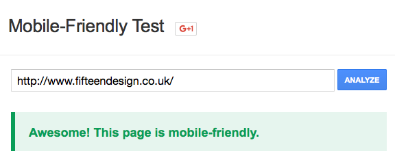
Back in February 2015, Google announced plans to increase the rankings of websites that were considered mobile friendly in mobile search results. It’s important to note this will only affect mobile search results; desktop and tablet search results will not see their rankings change. Due to the increasing number of people viewing websites on mobile devices, many companies were desperate to get their sites mobile ready for the April 2015 deadline. Using Google’s mobile-friendly tool users could check to see if they’d pass the test.
How Fifteen do it
Stage 1 – Browser tools
There are a number of ways to test a website’s responsive design capability throughout the development process. Initially, we use our browser’s developer mode, I tend to flip between Firefox’s responsive design view as I use Firefox as my default browser and Google Chrome DevTools’ Device Mode. As we near the end of a project and we think we’ve got everything pretty much there we’ll hop onto our device testing lab to really put the site through its paces. After all, there’s no better way of testing a device but on the device itself!
Stage 2 – Device Lab
There are a few reasons why we can’t just rely on the browser based responsive tools:
- Our development computers will (usually) be a lot faster than mobile devices, so we need to test our sites on the devices to make sure they load in an acceptable amount of time.
- The rendering engine used by our desktop browser tools will be different to the ones used by mobile browsers, so websites may end up rendering differently.
- While we know the resolutions for each device, they each have their own user interface which will affect how much of the site you’ll actually be able to see.
Our custom built testing lab has a huge range of devices (increasing by the day) that allow us to test for device specific problems much like we test for browser specific problems.
To speed up the testing process we’ve linked all of our devices together so interactions are carried across to all connected devices at the same time, including scroll events, button clicks and even page changes!
After the completion of our device lab, we’ve been able to speed up the time required to test on separate devices dramatically and concentrate our time on giving our users a better user experience.
If you’re concerned about how your website works on mobile devices get in touch today

