Logo design is a subtle art. Not just in the way they show space but also in the way they hide little Easter eggs. Take a look at some of the greatest messages hidden in some of the most-famous logos.
FedEx:
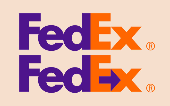
FedEx is a well-established delivery service company, and its logo is seen on the side of trucks, planes and white vans.
While the logo may look simple with the colours, within the type there is a hidden gem. Have you ever noticed the arrow hidden in the negative space between the ‘E’ and ‘X’? The arrow represents getting places with speed and precision, which sums up the FedEx brand perfectly.
Toblerone
Established in Bern, Switzerland, 1908, Toblerone is a world famous chocolate bar that is loved by millions.
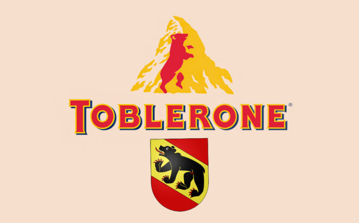
Their logo consists of a mountain that apparently represents the Matterhorn Mountain in Switzerland, which is why the bar is triangular shaped.
However, according to the makers’ sons, the triangular shape originates from a pyramid shape that dancers at the Folies Bergeres created as the finale of a show. Lastly, going back to where the chocolate bar was created (Bern, Switzerland) within the letters of ‘Toblerone’ the word ‘bern’ is hidden within them.
The logo also has a bear on it, which is in the negative space of the mountain. This symbolises the coat of arms of Bern. The colours of the logo are even the same as the flag.
Google is probably everyone’s go-to web search engine and the answer to every question ever asked. This makes it one of the most recognisable logos in the world.
Google’s Mission is to “organise information and make it universally accessible and useful”. They are also known for their approach to the working environment, by not playing by the rules and simply having fun. I mean, they have a slide going from one office floor to the other (if that isn’t fun, I don’t know what is).
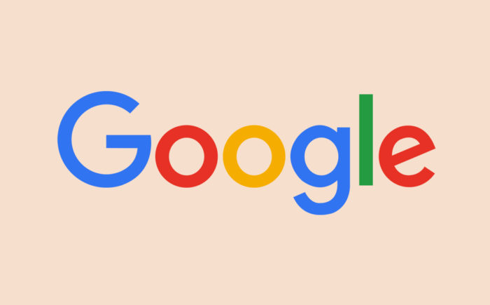
With all that said, you may think there isn’t much to their logo? However, Googles logo is supposed to symbolise that they don’t play by the rules and know exactly how to have fun. They don’t have a crazy typeface or icon, they just simply relay their message with colour. The colours they have chosen are the 3 primary colours with an exception to the green which breaks this rule, representing breaking the rules.
Coca-Cola
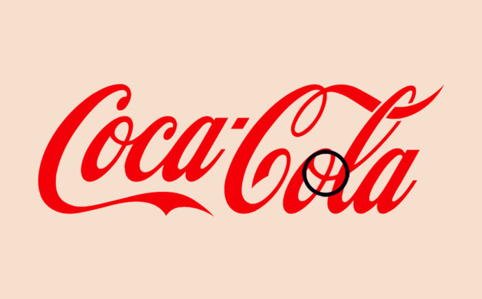
This one might take a little time to actually see. Even Coca-Cola themselves don’t really associate the hidden image with their logo. Nonetheless, the hidden message in the Coca-Cola logo is actually the Danish flag.
According to Coca-Cola, this wasn’t their original intention, but once they discovered that Denmark was named the “Happiest country on earth”, they even set up a media stunt in one of Denmark’s biggest airports and welcomed people with flags.
For some reason, they didn’t hand out any free Coke though.
Toyota
Founded in 1937, Toyota is a widespread brand, that is popular for manufacturing cars. Although Toyota has been around for 82 years, their current logo as only been around since 1990.
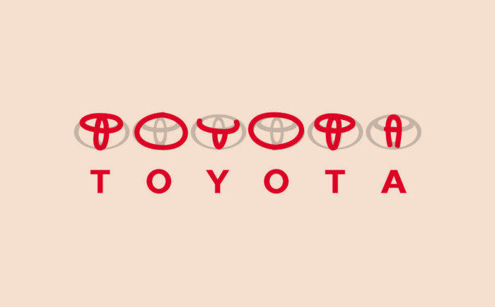
Toyota’s logo represents three hearts of the company: the heart of the customer, the product and the progress in the field of technology. Did you also know that Toyota’s logo consists of all the letters in the company name; if you separate the logo’s icon?
Amazon
Amazon is leading the way when it comes to shopping online, and they have made sure that their logo represents that. The yellow arrow in the logo starts at the letter ‘A’ and ends at the letter ‘Z’, hinting that they sell everything ‘from A to Z’.
This also can imply that they get from ‘A to Z’, with the ‘A’ being the company and the ‘Z’ being the customer. The arrow also looks like a smile too, don’t you think? This represents the customer being happy and satisfied with their service.
My Fonts
My Fonts is one of the most popular online font resources, allowing users to have access to a number of different fonts.
Now, you probably noticed the hidden image right away and if you didn’t, like myself, The ‘My’ in My Fonts is stylised to look like a hand. This implies that the user can get their hands on whatever font they like.
Baskin-Robbins
Baskin-Robbins is one of the worlds largest chains of ice cream and cakes and is commonly known for its limitless flavours.
When Baskin-Robbins was founded they began with only 31 original flavours. That number is hidden within the logo, between the ‘B’ and the ‘R’, acting as the shape of the ‘B’ and the stem of the ‘R’.
Pinterest is a popular social media application that allows users to find projects and recipes they like from across the web and ‘pin’ them to their online notice boards.
With that said, let’s get to the point (pun intended). Within the logo, the letter ‘P’ incorporates pin.
Tour de France
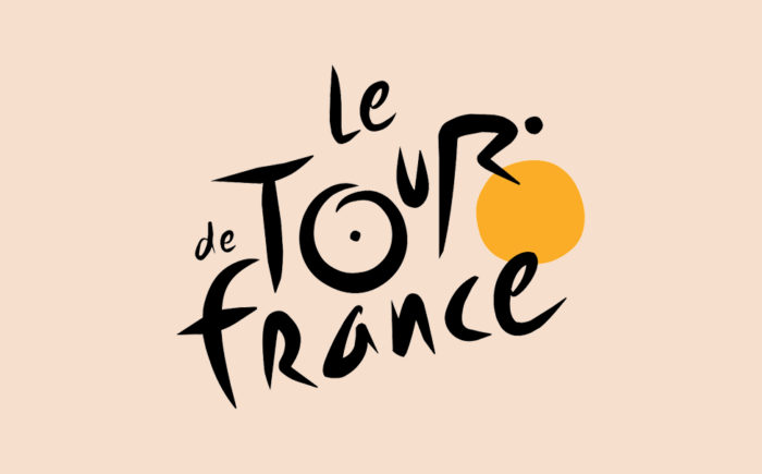
The Tour de France is an annual multiple stage bicycle race primarily held in France, while also occasionally passing through nearby countries.
To some, their logo may just look like a cool, creative font. However, the logo actually consists of cyclists, in the word ‘Tour’. If you look closely at the ‘O’, ‘U’ and ‘R’ you will see the cyclist on his bike, riding downhill with one yellow wheel.
Conclusion
Good logo design is a fine art with some of these examples lasting several lifetimes. If you’re interested in designing a new logo or even just creating a rebrand contact us today and let us help you leave a lasting impression.
