When a company rebrands it’s usually to renew or modernise their current brand. This ensures that companies stay current and with the times. In this blog, I am going to outline 3 of the best rebrands of 2019 so far.
Volkswagen
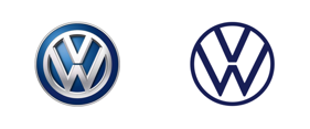
Volkswagen, a German automaker founded in 1937, is one of the biggest automotive companies in the world. Their logo is recognisable worldwide and this week they revealed their new visual identity. Taking a much more modern and stripped back approach, the new logo design is clear and simple. Replacing the three-dimensional chrome effect, the new logo has been changed to a flat two-dimensional design. To date the Volkswagen logo has always been blue and white, however, a new blue tone has been introduced, giving it a much fresher and modern look. In addition to that, for the first time in decades, the ‘W’ in Volkswagen logo has been isolated from the circle, making it a much more open and clean design, reducing it down to its essentials.
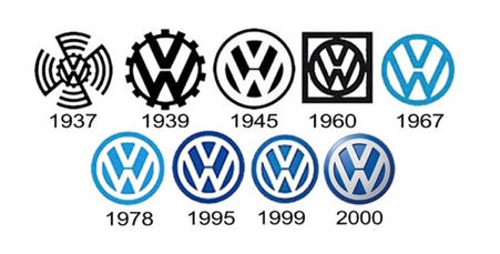
Volkswagen through the decades:
Volkswagen’s main mission is to have the new design work better across all digital platforms. Now that the logo is more simple and flexible it will appeal to a wider audience across all media.
According to the Volkswagen newsroom “The new visual language of the brand will be very different from that presented by Volkswagen to date – it will be bolder and more colourful. The focus will be on people. Volkswagen will no longer concentrate on perfectionism in vehicle photography. In future, the main objective will be to present realistic situations that customers can identify with.”
In addition, Volkswagen announced that the brand is now becoming female. Well, the voice of the brand that is. For decades Volkswagen has had a male voice present their vehicles for advertising purposes. With the aim to sell the vehicle for the vehicle specifications, they are now taking a different approach. Their main objective is aimed towards the individual. Their visual language is going to be much more colourful and bold moving forward
Energizer
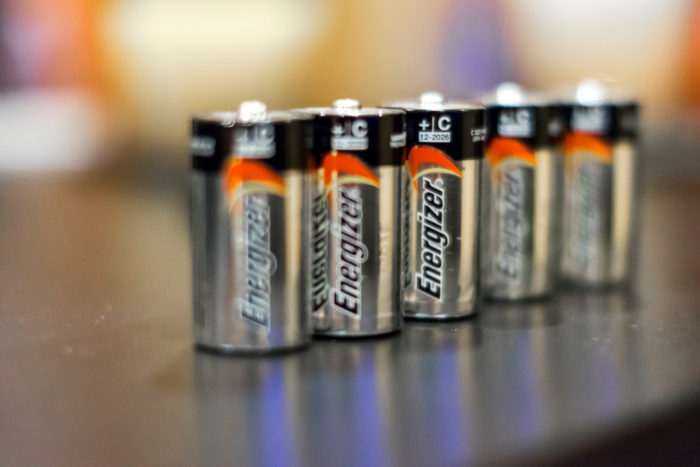
Founded in 1896 Energizer Holdings, Inc. is an American manufacturer and one of the largest manufacturers of batteries in the world. Known for producing the longest-lasting batteries around and of course the world-famous Energizer Bunny, they decided to rebrand this year!
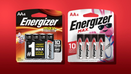
With all of Energizers competitors being all black, copper and extremely serious, the Energizer brand needed to display the opposite to stand out from the crowd. Designed by DDW (Sausalito, CA), they describe the rebrand as a bold, light-hearted design system. For example, on the earlier packaging, the Energizer Bunny was seen more “extra”.
The solution? According to DDW “It was finally time The Energizer Bunny take centre stage. And that’s exactly what he’s done. The Energizer Bunny features larger than life. He’s finally taken his rightful place as the proud hero of the No. 1 battery brand.”
Take a look at the Energizer brand story
Android
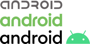
Developed by Google, Android is a mobile operating system that was initially released in 2008. Designed primarily for touchscreen mobile devices, Android is one of the biggest of its kind. Since their initial release Android has had two rebrands. They started with a futuristic sans serif logotype from 2007-2014 and then rebranded in 2014. After rebranding, they introduced a new green and applied this to the Android robot and the typeface. Fast forward to 2019 and they have rebranded again.
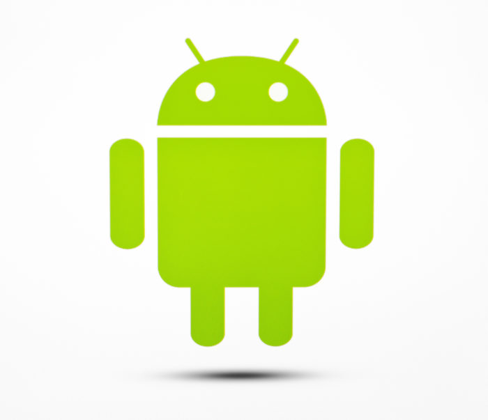
At first glance, it may not look that different. However, the typeface has been thinned down and stems have been added. Rounded corners have selectively been applied, all while remaining in lower-case. Additionally, Google has simplified the Android robot. They have done this by removing the body and just keeping the head. The curve radius of the bot has been adjusted and the eyes and antenna have been moved slightly too. The reasons for this is because Google has decided to have the Android bot a permanent fixture in the logo. Now that it is a permanent fixture, it needs to be able to fit in any scenario.
They have accomplished this by customising their colour green by adding a hint of blue and accompanying this with a secondary colour pallet. This includes a blue, navy as well as tertiary orange, chartreuse and light blue.
Although the changes may not seem that drastic, if you imagine the size of Android, with users all over the world, changing the colour pallet and removing the robot’s body – this is a huge difference for the brand.
What are your thoughts on these company rebrands?
If you’d like to rebrand your logo or design a site from the ground up Fifteen are ready to help. Our dynamic team of designers, developers and digital experts offer unparalleled access to digital marketing and can turn your logo into your identity. Contact us today to find out more.
