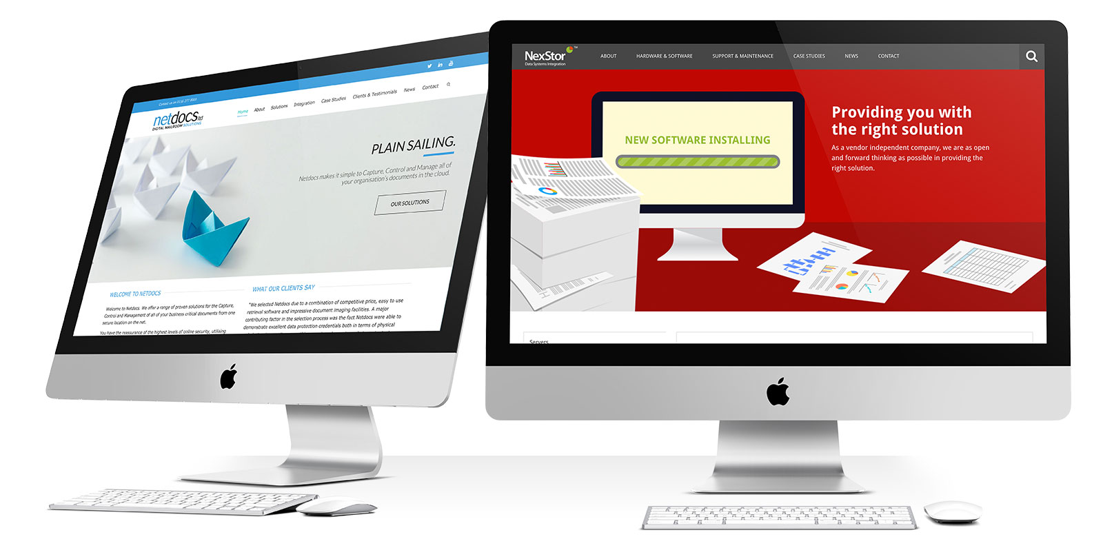
I’m sure that, in our travels across the web, most of us have encountered a slider in one form or another. It’s usually right at the top of the page and has a button on it with some important information. Not sounding familiar to you? Keep reading to find out why!
Orphans in Need and Grimsby Auditorium use their sliders to either promote products, events and campaigns. They often have multiple campaigns running at once so a slider is important to showcase them all within the same area.
Why do we use sliders?
Sliders are quite common on most websites nowadays, especially if the website owner wants to present you with some information in an interesting way. A slider usually will have some information, and what is known as a call to action button on it. This is usually “Read More” or “View All Products”, etc.
Why are they important?
Sliders are great at accomplishing three main tasks (in my humble opinion):
- Presenting a lot of information in a limited amount of space
- Presenting that information through a visual medium which is engaging to the end user.
- Offering the user a chance to act on what they have read.
Netdocs and Nexstor use sliders to illustrate what they do and showcase the benefits of choosing them as a B2B service provider.
What are the drawbacks?
Sliders are pretty good at the three main tasks which I mentioned above. However, they do have a downside – that is that they are often missed by the user. This is because the user is so used to seeing advertisements where the slider is usually placed on the website that they simply scroll past it.
This is a well-researched phenomenon called “Banner Blindness”, and as I mentioned at the start of this article, this may be why you’re not familiar with sliders.
How do I fix it?
There are several things you can do to fix this “Banner Blindness”, and a few are:
- Don’t have your slider right at the top of your page. If it’s central then it’s less likely to be missed.
- Make your slider a full-screen slider. You’ll often see these on one-page websites, and they’ll cover the entire window. You scroll down, and then the content appears. It’s a pretty good way of saying “Don’t ignore me!”
- Check if your slider is too fast. Remember, people have got to read the content that you put on there, otherwise it WILL get ignored.
- On the other side of the coin, check that it’s not too slow as well, as then people will only read your first slide, and that’s opportunities to share your content lost. Whether it’s photographs or products.
Should I use a Website Slider?
In short, yes! We here at Fifteen use sliders quite regularly and they are often a great asset to a website. They’re a great way to display information in an alternative format.


