Welcome to The ThunderHack!
On the face of it, the premise of a “Larahack” (Laravel Hackathon) is simple. A group of programmers, professional and hobbyist alike, agree to spend an entire weekend competing against one another by ‘hacking’ (building) something with Laravel.
You can work as a solo developer, or gather a team and build something together.
Under the surface, it’s a bit more complicated. A theme is announced at 9 am on the Saturday and voting commences at midnight on Sunday.
Voting runs for a week, and anyone is able to vote as long as they have an account on the Larahack website. There are three categories to vote for; “Best Use of Theme”, “Best Use of Laravel” and “Best Idea/Project”. This means there’s the potential for three winners or one winner in multiple categories.
Companies often sponsor the event and you can win a variety of things, including but not limited to; free web hosting, credit for various SaaS apps, game keys and most importantly, bragging rights.
You are not constrained to the theme but in order to maximise your chance at winning it is best that you stick within the theme.
This is the 2nd Larahack I’ve taken part in and the 2nd Larahack of which I have been one of the winners. [The first Larahack I spent building the website for the Laravel UK website, where the hackathon is hosted from, with a group of extremely talented people, and so I could not take part in the event.]
Now, you may be asking yourself; “Why would a developer who works a 9-5 want to spend his weekend coding too?”. It’s a perfectly valid question and one which I’ve had to answer to friends and family when I’ve not been available on that given weekend.
While working over the weekend after a full week of work sounds absolutely mental to most people, to me it’s a massive learning opportunity, and a way to challenge myself. Plus I’m a sucker for competition.
The theme for the hackathon this time around was “We must rebuild”, and that’s often the first challenge presented. How does one interpret such an open-ended theme? Should I rebuild Facebook/Twitter/Social Network Du Jour?
That’s one of the ‘fun’ things about this kind of event, you and all of your competitors are trying to figure out the most interesting use of this theme whilst also keeping in mind the other two categories for voters, and attempting to tick all three boxes; Best use of Laravel, Best use of Theme, and Best Idea/Project.
Larahack – The Pitch
Eventually, I settled on rebuilding an old project of my own from 2011. This project was featured in online publications such as the Sydney Morning Herald and makeuseof.com back when I originally launched it and was called 30 Day Challenges.
The premise was simple. You set yourself a challenge to stick to for 30 days, and keep notes and track progress through the website. Other users could also attempt your challenge. A good example of a popular challenge back then (and I think now too!) was to Quit Smoking in 30 days or Read 3 books in 30 days. Other users attempting your challenge could offer messages of encouragement and support, in effect giving you a built-in support network.
One of the nice anecdotes for the original site was that in fact, the first 30 Day Challenge on 30 Day Challenges was to build the entire site in 30 days. A challenge which I did in fact complete.
Keep in mind, this was before social networking had really exploded, the latest iPhone was the iPhone 4, and the App Store was still in its infancy and there weren’t many things which did this in the palm of your hand, so it was quite a useful service and garnered quite a lot of interest.
Unfortunately, developers are often changeable, especially at the age of 19, and as such my interest in the project waned and the website eventually languished and the domain expired.
Anyway, that’s quite the “elevator pitch” to the product which I had decided to rebuild over a weekend.
Bearing in mind, the last time around this took me 30 full days to build, I knew I had maybe bitten off more than I could chew this time around. While I’m not going to bore you with every technicality or rationality, I do hope to cover the three key considerations I made in order to ultimately build a product which I was proud of.
Changing the default Laravel design
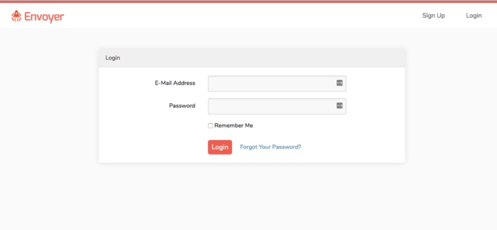
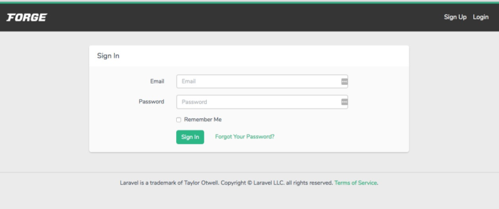
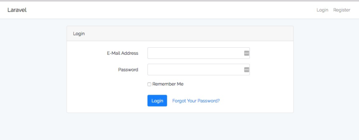
Laravel ships with a default design scaffolding using Twitter’s Bootstrap CSS framework, and once you have worked with Laravel or Bootstrap long enough, you do get an eye for these things.
Note the similarities.
Unfortunately, a lot of entries to the previous events focussed a lot on substance over style and maintained default and rather bland designs. This is often the developer’s downfall, but it did mean that there was a gap in the market. Something I could leverage over my competition.
I also know that my voting audience is primarily going to be other Laravel developers who can recognise whether the effort has been placed into the design, or whether I’ve just opted to use the stock scaffolding which Laravel provides.
I’m going to preface this by saying that, while I am not a designer, and never claim to be, I’ve built enough websites over the course of my career (professional and hobbyist) that I understand the basic structure of a website, and can make something stand out from the crowd.
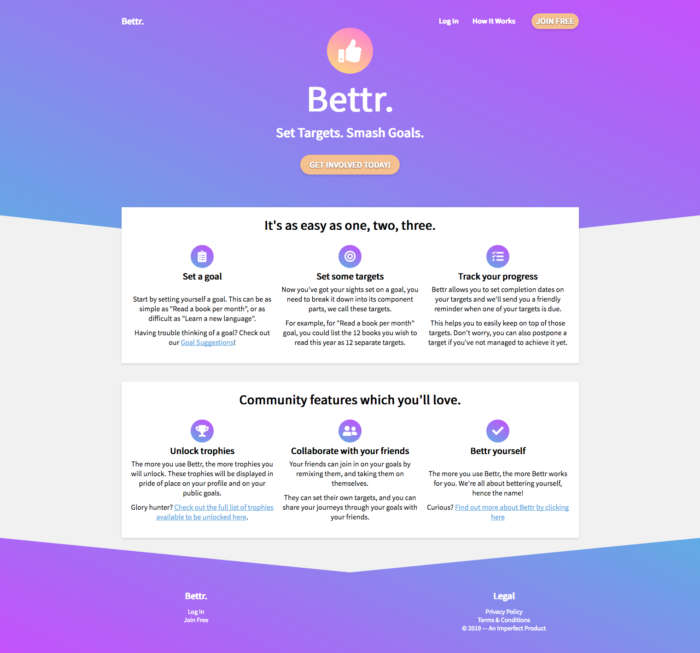
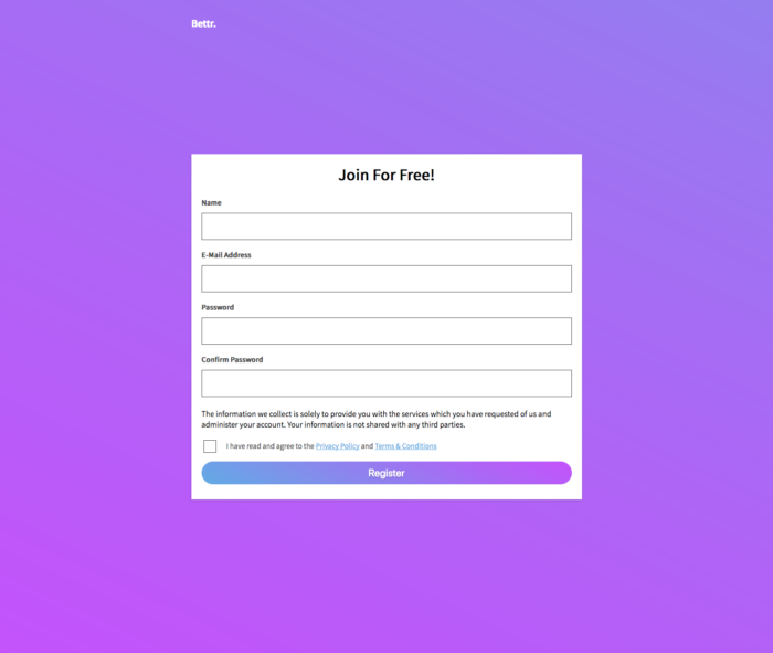
So this is where I started. Creating a simple but unique design. Something which was not too complicated but also had enough modernity to catch the eye. We’re talking distraction free login and register screens, gradients and slanted sections.
I feel that this single step could have clinched the competition win for me.
Optimising Laravel’s User Experience
Another thing which definitely ties in with the above is user experience (UX). If you opt to use the default Laravel scaffolding provided, you do not have much control over the user experience, whereas because I had chosen to spend that time on the design, I had.
The slants at the top of every page form an arrow, naturally drawing the readers eye down the page. There’s a call to action front and centre, above the fold, and there are action items just below the fold. Another touch which I was quite proud of is if you do not have any content between the two arrows, they will line up perfectly, creating a symmetry which is pleasing to behold.
The absolutely minimal navigation reduces clutter but also gives further weight to those links.
There’s also completely distraction-free login and register system which are dedicated to one thing, getting the user on board.
These also offer a sense of security, from a developer perspective as well as a user perspective.
From a developer perspective, distraction-free pages don’t try to load any external assets, which minimises the risk of third parties loading any potentially malicious/unknown scripts on these more sensitive pages where users enter personally identifiable information.
From a user perspective, it offers a sense of security as well as focus, because websites such as Google, Facebook and Twitter all offer distraction free Login and Register pages, so you’re subconsciously making that comparison.
Utilising VueJS in Laravel
I wanted this website to feel slick and easy to use, and I’ve been using VueJS a lot in client projects at the office, so it was only natural to put these skills to the test on this project.
Vue is a client-side javascript framework which facilitates things such as Single Page Applications and Progressive Web Applications, and also all of the fancy things people are used to now such as; navigating to new pages with no page refresh, entering content into a form and having it instantly reflected within the browser without a page refresh, etc.
It typically improves the flow of an application and opens you up to later expansion into web applications which you can save to your phone and run offline, which is something I wanted for the original site, and something which I want to explore later on in this project.
Another benefit of using Vue, as a developer, is that you don’t have to write any front-end code at all, and you can start with your API. That is the bits of the website which Vue calls on to get the data to display.
This is typically called API Driven Development, and it means you can start out the project by building an API to get data in and out of your database, working out the database structure, and then building the design/user, experience/front-end Vue components to consume the APIs afterwards.
This splits up the development nicely between Front End and Back End, and being someone who prefers Back End, works well for me. Were I working with a teammate, it also has the benefit of giving a natural division of labour between two developers.
Conclusion
Somewhat ironically, given that before I became Lead Developer for Fifteen I specialised in mainly Back End Development, the majority of my time on the hackathon wasn’t spent on building the actual features but instead on optimising the design, user experience and journey.
This story does have a happy ending though, as I achieved first place in two of the three categories; Best Idea/Project and Best Use of Theme. Time well spent.
If you’re interested in the general concept or want to see the website, you can visit https://bettr.today. Please note that this is a project built by myself in my own time over the course of two days and does not reflect the work of Fifteen.
