Navigations are the key to a user’s journey through a website. The best outcome you can possibly receive from a website that you have created is the user having a great experience. This is vital. That is why many designers and developers consider the navigation to be the most critical component of a website.
When designing the navigation for your site, the designer has multiple options. You can have a standard navigation, lying horizontally across the top of the page. Alternatively, you have a vertical navigation, with the choice of which side you have it being entirely up to you. However, there is another option…
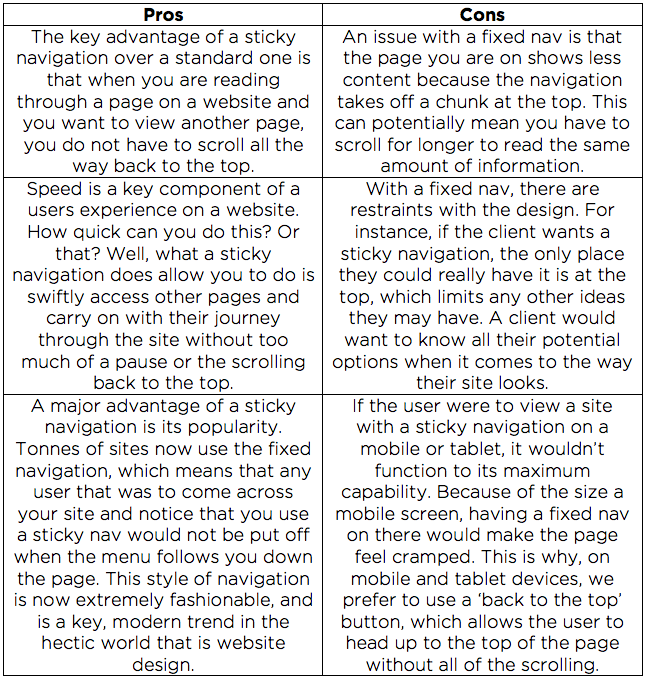
A sticky navigation, or a ‘fixed’ nav, is just like a standard nav, but with one major difference. With a normal navigation, when you scroll, the menu stays at the top of the page. With a sticky navigation, when you scroll your way down the site, the menu stays with you. This saves the user from pointlessly scrolling back to the top of the page to go to a different area of the site. With the fixed navigation, they can view a page and not have to go back to the beginning.
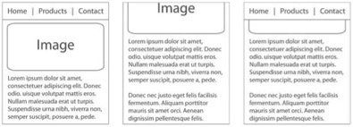
Here are some examples:
The left image shows the top of a page with a standard navigation, with the second image showing a site with a standard navigation after it has been scrolled down. As you can see, the navigation is not there and is still at the top of the page. However, the right-hand image shows a site that has a sticky navigation. In contrast to the other two images, when you scroll through the site, the navigation remains with you.
Sticky navigations have produced good results since their creation, with research showing that they are 22% quicker to navigate, compared to standard top-of-the-page menus. Although they couldn’t state a reason why, 100% (yes, 100%) of people found they preferred the fixed navigation.
Here at Fifteen, we love a sticky navigation. As well as using one on our own site, we have used this style menu on Bodychef’s brand new site, Tracking My Car’s project, Elsie’s Attic’s new e-commerce site and of course, the Fifteen site itself! Go to www.fifteendesign.co.uk/blog to read more about these sites going live and to see what they said themselves about their project!


