I get so excited about Pantone’s ‘Colour of the Year’ announcement. When the sassy hue of Ultra Violet 18-3838 was crowned just recently it sparked a whole train of thought. Which explored the use of the colour purple within design, branding and advertising.
Perhaps a choice more fitting to a teenage girl, my favourite colour is purple. As a child, I was asked what colour I wanted my bedroom, and of course, the answer was purple. Being less evident than the girlie pink all my friends liked, I thought I was somewhat rebellious.Preferring purple as a more mysterious alternative (Of course, I wasn’t). Fast forward 25 years and I still have a purple bedroom. Although in a delightful shade of velvet plum rather than princess periwinkle! But why can’t I see my bedroom in any other colour? Why did I choose it in the first place? The decision sprouted from personal taste, but what’s going on psychologically to lead me to this choice? Personally, its familiarity.
I have always fallen asleep to the harmonious tones of purple, the nostalgia makes me feel safe. Purple is a secondary colour, made up of red and blue. The former signifying love and femininity and the latter serene and calmness. Purple takes on the properties of both – which makes it perfect to decorate a place of sleep and rest.
This being said, purple is not reserved for a favourite colour of teenage girls. On the opposite end of the spectrum, for example, the stereotypical image of a pimp depicts extravagant purple attire. Presumably because of its connotations of dominance and luxury. Roald Dahl’s fictional character Willy Wonka strikes an uncanny resemblance with his purple coat and top hat. (Pimp of chocolate or Oompa Loompas, you decide.)
Long associated with power and wealth, purple has been the colour of royalty and nobility. Cleopatra was said to have been passionate about purple, with gowns, sofa’s and sails all in the shade. In Egypt, purple is sacred and a symbol of faith. Even Julius Ceasar came home wearing a purple toga after a visit to the ruler, then becoming the royal colour of the Ceasars.
Purple’s elite status originates from the cost and rarity of the dye used to produce cloth and other items in this colour. ‘Tyrian purple’ as it was then known was created using the mucous of sea snails. Nice. Even the smallest amount of dye needed an awesome amount of mucous to produce it. Laws were even introduced to protect the use of the colour purple.
When Henry Howard, Earl of Surrey was accused of high treason against Henry VIII, one of the pieces of evidence used in the trial was that he had been ‘seen wearing purple’. Purple is a colour only the King could wear. Queen Elizabeth I followed in her father’s example and also forbid anyone but close members of the royal family to wear it. It wasn’t until 1856 when William Henry Perkin of the Royal College of Chemistry stumbled across a cheaper and more available way of producing the synthetic colour purple. It became more accessible and acceptable to the masses.
His Royal Purpleness
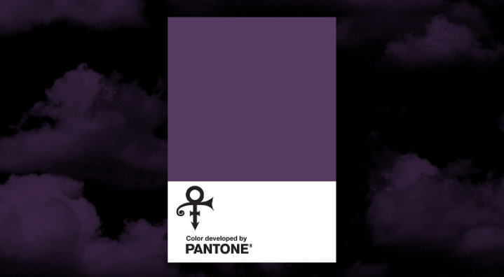
The colour’s history and heritage may explain why it has never been a mainstream choice. Those that did choose it, being creative and often eccentric types. Music legend and icon, Prince, became synonymous with the colour throughout his career. From the album and film Purple Rain to his exciting wardrobe and even a custom made purple piano. It cannot be disputed; the unique hue captures the mystery and intrigue of an unconventional but brilliant performer. Pantone even created a distinctive shade of purple Love Symbol #2, in honour of Prince in 2017. Laurie Pressman, Vice President of the Pantone Color Institute, says;
“While the spectrum of the colour purple will still be used in respect of the ‘Purple One,’ Love Symbol #2, will be the official color across the brand he left behind”
And there’s that word, brand.
When creating a business’s branding or logo, there’ll be many design decisions to make including the use of colour. You need to have an understanding of tone and its perceptive power, impact on the audience and ultimately how it enhances and supports the business messaging. Purple, as I stated earlier is a dichotomy of red and blue. A colour blend can cause uneasiness if the undertone is not clearly defined. Once it is, the colour embodies the characteristics of its undertone. For example, a purple with a blue undertone will be calm and serene, a purple with a red undertone will be lively and warm.
Overall purple’s colour associations are positive, representing quality and luxury. However, it’s mainly easy to get the use of purple wrong. It’s a colour that can easily slip into arrogant and even cheap, tacky territory. It is perhaps because of this that brands shy away from the use of purple. It also lies at the very shortest of wavelengths visible to the human eye on the colour spectrum. So, from a design point of view, it’s a hard colour to work with. Perhaps all this explains that if a brand gets purple branding right, they get it really right.
I explored those brands that have had the confidence to do just that, use the colour purple to illustrate and represent them as a business. I’ll examine the connotations with each particular example.
Cadbury
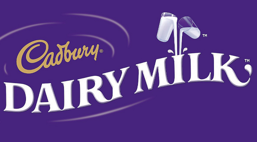
Perhaps the most famous brand to heavily use the colour purple in its branding and for the longest time too. Cadbury’s chocolate bars were first adorned with royal purple wrappers over a hundred years ago. The packaging honoured Queen Victoria, who was said to have favoured the shade. It explains the chocolatiers decision to use the colour to attribute the same luxury and grandeur on its product as associated with royalty. Cadbury tried to trademark this particular hue of purple in 2004 (Pantone 2685C). But it was rejected after objections from competitor confectioner Nestle. Yet, Cadbury’s successful 1995 bid means the colour can’t be used when explicitly wrapping chocolate bars or drinks. Interestingly ‘The Big Purple One’ of Quality Street fame is Nestle owned. So, in reality, any brand can use the colour. But there is no denying its distinctive character and relationship with the Cadbury brand. As one spokesperson says;
“Our colour Purple has been linked with Cadbury for more than a century and the British public has grown up understanding its link with our chocolate.”
Kraft, Cadbury’s parent company also hold a trademark for the particular shade of lilac used by its Milka brand.
Premier Inn
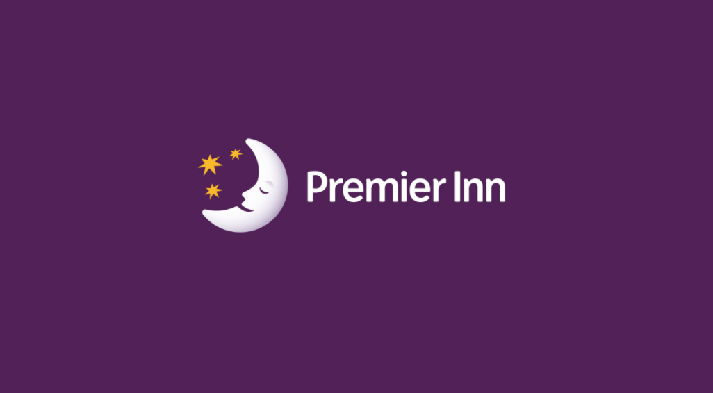
Premier Inn was founded in 1987 by Whitbread leisure and hospitality company. The British chain is the UK’s largest hotel brand. A little bit like my bedroom, Premier Inn’s purple has a red undertone. Which conjures up feelings of calm, peace and relaxation. Supporting the brand’s message of ‘A good night’s sleep guaranteed’.
Of course, like Cadbury and many other brands, Premier Inn will be benefitting from the implied sense of quality and trust associated with purple. In 2014, Premier Inn played on its specific colour characteristic with its Purple Sauce campaign. In collaboration with chef Ed Baines, the sauce was marketed as a perfect addition to the Premier Inn breakfast. It was only available for a short time. They ran competitions alongside to win family breakfasts and bottles of the limited-edition sauce. Premier Inn had been working with comedian Lenny Henry since 2008. This campaign perfectly complimented the light-hearted, tongue and cheek style they had adopted.
Vimto
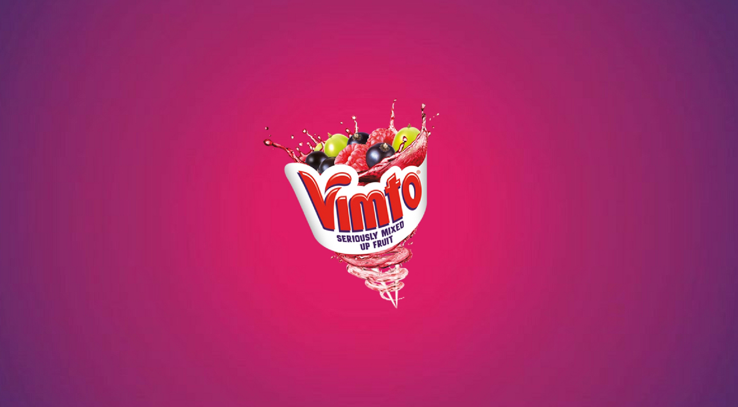
Vimto is not a brand associated with a long history, but the soft drink has been around in some form since 1908. Initially, a type of ‘medicine’ called ‘Vim Tonic’ hence the brand name of Vimto. Its inclusion of raspberries and blackcurrants meant that the purple branding of Vimto has become recognisable. But not so obvious was that Vimto’s previous branding was based on stripes of the patriotic colours red and blue which weren’t dropped until 1988. Now, the red and blue are still present, just within the purple. Although the text based logo itself is red, it’s almost always accompanied by the multi-purple gradient background. Fresh and fruity, even a bit groovy or wacky. A standout, unique brand, Vimto made the colour purple the forefront of many of its campaigns.
Purple Ronnie featured in Vimto adverts for several years. The animation, created by Giles Andreae was a simply drawn stick figure, often wearing a purple t-shirt. Alongside the drawings were rhyming captions which sometimes including rude language. Later, in 2005 the slogan ‘Schlurple the Purple’ follow ads where a person drinks Vimto then a weird thing would happen to them like their head shrinks or their ears grow. This cheeky and sometimes peculiar approach to its adverts echoed the mysterious and magical qualities of the colour purple. Ribena and WKD also have purple branding. They’ve have used similar formats with playful, quirky and sometimes downright strange setups.
E4
Moving forward with both advertising and branding as a whole, it is the emergence of those identities which are made rather than heritage names that have evolved. A project by Matt Rudd of Rudd Studios, Channel 4’s younger sibling E4 needed a brand which was rebellious and different. The studios themselves describe the project as ‘young, purple and cheeky’. They were set on the colour purple from the offset. Orange was the only other potential, but many brands were using this at the time. Encapsulating a certain feel and energy, E4 was purple. With its unique logo, the brand has become a classic. Like Vimto, but with more of an adolescent edge. E4’s campaigns are also ambitious, sometimes random but imaginative.
In Conclusion
Considering the brands discussed, it seems purple manifests itself to radiate distinct connotations. Which are dependent on the shade or undertone and the, of course, the broader branding or situation in which is it used. I’ve broken them down below.
Royal, quality, dignified, proud, luxurious and noble
Like Cadbury’s these brands often have a wealth of history. The heritage signifying trust and confidence. Connecting to these names makes the consumer feel they’re indulging and revelling in a product of great quality.
Calm, serenity, relaxation, safety and peace
Premier Inn was my example of how purple can signify a place of relaxation and calm. Its there for the customer as a place of comfort and safety when perhaps they are at their busiest. A brand you can trust and rely on to deliver a service.
Wacky, groovy, fun, young, imaginative and ambitious
Vimto, Ribena, WKD and E4 all take on these characteristics. Not necessity products, but ones that inject a little bit of fun into ordinary and everyday life. They are ambitious, imaginative and sometimes edgy with their campaigns, hoping to strike a chord with their audience.
Mysterious, wise, devoted, eccentric, intriguing and creative
The best example for this I have explored is Prince. He created a brand represented by himself as a performing artist. He portrays mystery and intrigue. The audience believes he is more intelligent and more creative than themselves, so they enter a state of devotion and worship to feel closer to this.
If you think there are other avenues I’ve not investigated when it comes to purple branding, do let me know. What are your favourite purple brands? What message do they look to convey and how does the use of purple support and enhance this?